Time to study: ~120 min You will learn: nothing new. this is the chapter where u find out that the 11 before it were enough.


← Chapter 11 | back to HTML & CSS 101
there is no new property in this chapter. every line of css in it came from chapters 1 to 11. a real page is not made of clever things u have not met, it is the same 30 properties arranged carefully.
u build it in 6 steps, and u open the browser after every one. that is the whole method: never write more than about 20 lines before looking.
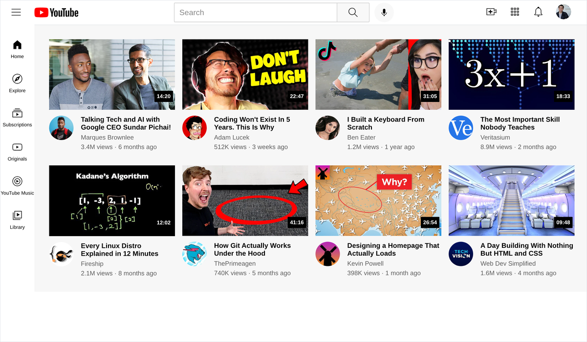
1. name the layout before u type anything
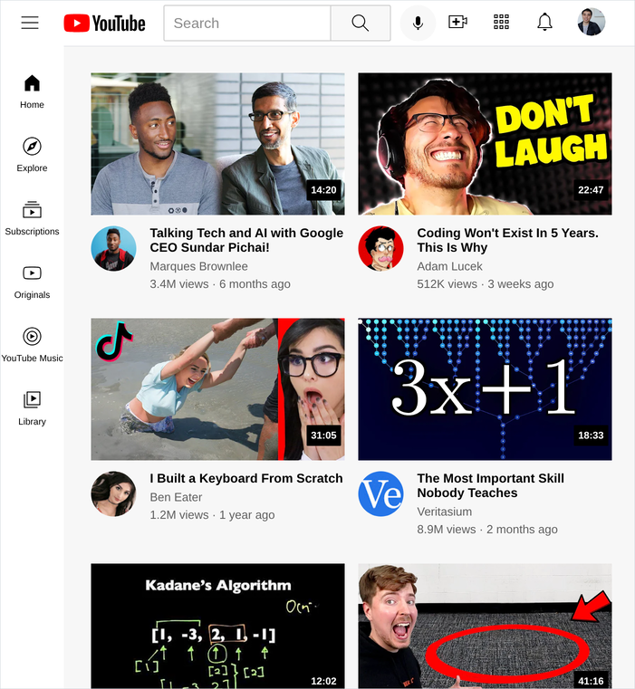
look at the picture and say out loud what each part is. u already know all 3 answers:
+----------------------------------------------------------+
|  header: 3 groups in a row, pinned to the top             |   flexbox
+------+---------------------------------------------------+
|      |                                                    |
| side | video grid: 4 columns, then 3, then 2              |   grid
| bar  |                                                    |
|      |   one card:  thumbnail, with a badge on it         |   position
|      |              avatar | title, channel, views        |   grid, 50px 1fr
|      |                                                    |
+------+---------------------------------------------------+
   ^ fixed, 70px wide, full height
- the header is one line of things, so flexbox.
- the videos are a repeating structure, and u do not know how many, so grid.
- the badge sits on top of the thumbnail, so position.
- the row under the thumbnail is a fixed avatar next to flexible text, so a 2 column grid.
that is the whole architecture, and it took four sentences.
2. the folder
the css is split into 4 files by what it styles. one long stylesheet works, and it stops working the day u have to find something in it.
youtube-clone/
├── Youtube.html
├── styles/
│   ├── general.css      the reset, and anything shared
│   ├── header.css       the bar across the top
│   ├── sidebar.css      the strip down the left
│   └── video.css        the grid, and one card
├── icons/               hamburger-menu.svg, search.svg, home.svg, ...
├── thumbnails/          thumbnail-1.webp ... thumbnail-8.webp
└── channels/            channel-1.jpeg ... channel-8.jpeg
- the whole thing is in this repo already, in youtube-clone/: the page, the 4 stylesheets and the 3 asset folders, all in one place. copy that folder and work inside it.
- the head loads all 4 sheets in order, and order matters:
general.cssis first so the others can overrule it.
<!-- Youtube.html -->
<head>
  <meta charset="UTF-8">
  <meta name="viewport" content="width=device-width, initial-scale=1">
  <title>YouTube</title>
  <link rel="stylesheet" href="styles/general.css">
  <link rel="stylesheet" href="styles/header.css">
  <link rel="stylesheet" href="styles/sidebar.css">
  <link rel="stylesheet" href="styles/video.css">
</head>
general.css is the reset from chapter 7, and it is the whole file:
/* styles/general.css */
body {
  margin: 0;
}

p {
  font-family: Arial, sans-serif;
  margin-top: 0;
  margin-bottom: 0;
}
3. step 1, one video card
build one card and get it right. eight wrong cards is eight times the work.
a card is 2 rows stacked: the thumbnail, then a row of avatar and text.
<!-- Youtube.html -->
<div class="video-grid">
<div class="video-card">
<div class="video-thumbnail-row">
<img class="thumbnail" src="thumbnails/thumbnail-1.webp" alt="...">
</div>
<div class="video-info-grid">
<img class="channel-image" src="channels/channel-1.jpeg" alt="Marques Brownlee">
<div class="video-text">
<p class="video-title">Talking Tech and AI with Google CEO Sundar Pichai!</p>
<p class="video-author">Marques Brownlee</p>
<p class="video-stats">3.4M views · 6 months ago</p>
</div>
</div>
</div>
</div>/* styles/video.css */
.thumbnail {
width: 100%;
display: block;
margin-bottom: 12px;
cursor: pointer;
}
.video-info-grid {
display: grid;
grid-template-columns: 50px 1fr;
column-gap: 15px;
}
.channel-image {
width: 50px;
height: 50px;
border-radius: 25px;
object-fit: cover;
cursor: pointer;
}
width: 100%on the thumbnail means as wide as whatever column it lands in. u never write a thumbnail width, and this one line is what makes the whole page responsive in step 6.display: blockon the thumbnail removes the few pixels of space an image leaves under itself, because an<img>sits on the text baseline. chapter 5 note 5.grid-template-columns: 50px 1fron the info row: the avatar gets exactly 50px, the text takes everything else. chapter 8 section 4.border-radius: 25pxon a 50px image is half its width, so a circle.
4. step 2, the badge on the thumbnail
the duration sits on top of the picture, which nothing in the flow can do. this is chapter 10 section 7, and it is 2 rules.
<div class="video-thumbnail-row">
  <img class="thumbnail" src="thumbnails/thumbnail-1.webp" alt="...">
  <div class="video-time">14:20</div>
</div>
/* styles/video.css */
.video-thumbnail-row {
position: relative;
}
.video-time {
position: absolute;
bottom: 16px;
right: 4px;
background-color: black;
color: white;
font-family: Arial, sans-serif;
font-size: 11px;
font-weight: bold;
padding: 5px;
border-radius: 1px;
}
now delete one line,
position: relative, and reload:

- the badge went to the corner of the page. an absolute element measures from its nearest positioned ancestor, and without
relativethere is not one, so the page takes the job. .video-thumbnail-rowexists for exactly one reason: to be the thing the badge measures from. it has one line of css and it is not decoration.bottom: 16px, not4px, because the thumbnail hasmargin-bottom: 12pxand the badge measures from the bottom of the container, margin included. 12 + 4.
5. step 3, eight of them
copy the card 7 more times, change the numbers in the filenames and the text. then turn the container into a grid:
/* styles/video.css */
.video-grid {
  display: grid;
  grid-template-columns: 1fr 1fr 1fr;
  column-gap: 15px;
  row-gap: 30px;
}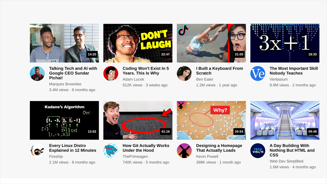
- u told it 3 columns once, and it dealt out 8 cards into 3 rows. add a 9th and u change nothing.
- that is why the video area is a grid and not a flexbox: the number of cards is whatever the page happens to have. chapter 8 section 8.
- if typing 8 cards by hand feels stupid, u are right. that is what javascript is for, and it is the next course.
6. step 4, the header
3 children, not 7: the left group, the search, the right group. that is the whole trick.
<div class="header-container">
  <div class="header-left"> ...menu and logo... </div>
  <div class="search-container"> ...input and 2 buttons... </div>
  <div class="header-right"> ...4 icon buttons... </div>
</div>
/* styles/header.css */
.header-container {
position: fixed;
top: 0;
left: 0;
right: 0;
height: 50px;
z-index: 100;
background-color: white;
border-bottom: 1px solid #e5e7eb;
display: flex;
justify-content: space-between;
align-items: center;
}
.header-left,
.header-right {
display: flex;
align-items: center;
flex-shrink: 0;
}
.search-container {
display: flex;
flex: 1;
max-width: 450px;
}
.search-bar {
flex: 1;
width: 0;
height: 36px;
font-size: 16px;
padding-left: 10px;
border: 1px solid #cccccc;
border-radius: 2px 0 0 2px;
}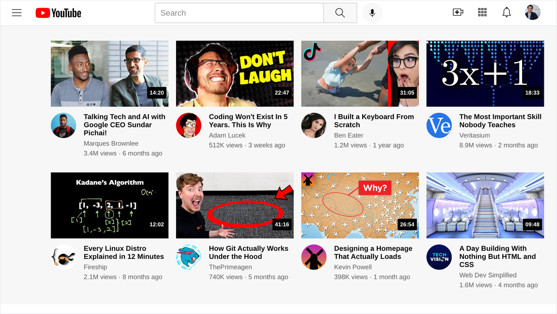
justify-content: space-betweenon 3 children does the whole layout. left group hard left, right group hard right, search between. no widths, no percentages.flex-shrink: 0on both side groups makes the search bar the only thing that gives way when the window narrows. one line, and it is a decision.flex: 1withwidth: 0on the input. grow into the space, and drop the built in width that would otherwise stop it shrinking. chapter 9 section 6.- the header is
position: fixed, so it is out of the flow and nothing makes room for it.padding-top: 80pxon the grid is that room, made by hand. chapter 10 note 2.
7. step 5, the sidebar
/* styles/sidebar.css */
.side-container {
  position: fixed;
  top: 50px;
  bottom: 0;
  left: 0;
  width: 70px;
  z-index: 100;
  background-color: white;
  padding-top: 15px;

  display: flex;
  flex-direction: column;
  align-items: center;
}

.side-button {
  width: 70px;
  height: 70px;
  border: none;
  background-color: transparent;
  cursor: pointer;
  transition: background-color 0.15s;

  display: flex;
  flex-direction: column;
  justify-content: center;
  align-items: center;

  font-family: Arial, sans-serif;
  font-size: 10px;
  white-space: nowrap;
}
top: 50pxandbottom: 0, and noheightanywhere. it starts under the 50px header and reaches the bottom of any window, because pinning 2 opposite edges is a way of sizing something. chapter 10 section 4.- the sidebar is a column flexbox, and every button inside it is also a column flexbox, which is what puts each icon above its own label.
- inside a column,
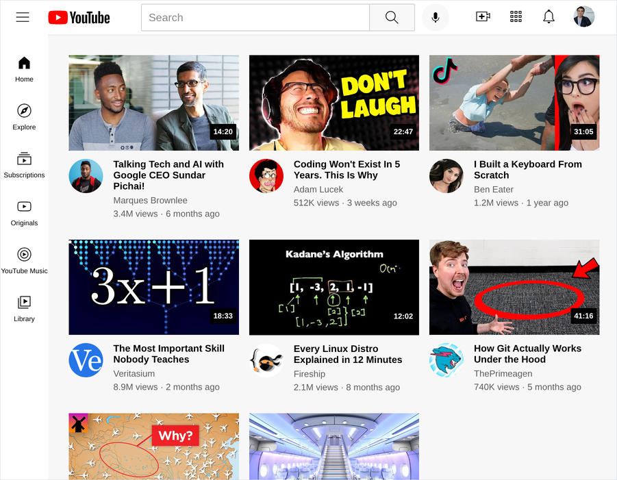
align-items: centercentres horizontally. that still catches me. white-space: nowrapkeeps “Subscriptions” on one line in a 70px box. it overflows deliberately, and at 10px nobody notices.padding-left: 100pxon the grid is the room for this, the same trick as the header.
8. step 6, responsive
everything is already flexible:
1frcolumns, a100%thumbnail, aflex: 1search bar. all that is left is the number of columns.
/* styles/video.css, at the bottom */
@media (min-width: 1050px) {
  .video-grid { grid-template-columns: 1fr 1fr 1fr 1fr; }
}

@media (max-width: 750px) {
  .video-grid { grid-template-columns: 1fr 1fr; }
}
the same page at 900px:
and at 700px:
- 3 layouts, one html file, 8 lines of css.
- they go after the plain
.video-gridrule or they lose. chapter 11 section 2. - the header needs nothing at all.
space-betweenandflex: 1were responsive from the moment u wrote them. - test with the devtools device toolbar,
Ctrl+Shift+M, not by dragging ur window.
9. what was wrong with my first version
youtube-clone/ is the finished thing, and it is the same css u just read.
the version i built in one sitting, before writing any of this, had 8 things wrong with it. not one of them broke the page, and every one is the kind of thing u only find by reading ur own code back:
| what was wrong | why it matters |
|---|---|
a class called .youbutbe-logo | harmless until u try to search for it |
icons//youtube-logo.svg, two slashes | loads fine, looks wrong forever |
background-color: grey on .header-left | debug colour, never deleted |
| 6 commented out lines | in 6 months u cannot tell a note from a mistake |
border-bottom-width above border-bottom | the shorthand already sets it |
| the same thumbnail and title 8 times | fine while building, not to ship |
| a badge on only the first card | card 1 was right, the other 7 were copies |
all the css in one <style> tag | chapter 5 says put it in a file, so now it is in 4 |
reading ur own code back a month later is a real skill, and this is what it turns up.
NOTES
-
build in steps and open the browser after every one. type all 200 lines first and u are debugging 200 lines at once. 6 steps means every bug is in the 20 lines u just wrote.
-
the html first, then the css. get every element on the page in the right order looking terrible, then style it. u can see the structure that way.
-
when something is in the wrong place, check the parent. 9 times out of 10 the element is fine and the container needs
display: flexorposition: relative. -
#e5e7eband#606060are the 2 greys in this page. real designs reuse a small set, and picking them out of a screenshot with the devtools eyedropper is a legitimate way to work. -
the header and the sidebar both have
z-index: 100. both are fixed and both need to be over the scrolling content. they never overlap each other, so they can share a number. -
this page has no javascript and does nothing. the search box does not search. that is correct for an html and css course, and the next course is where it starts moving.
Assignment
the project in this chapter follows HTML & CSS Full Course by supersimple.dev, and it is built in the same order he builds it: the video grid first, then the header, then the sidebar.
- Set up the folder and the 4 stylesheets, and write the head that loads them.
- Build one card, with no badge yet. Check it before u go on.
- Add the badge, then delete
position: relativeand reload so u see it fail. Put it back. - Copy the card to 8, using all 8 thumbnails and all 8 avatars, and turn the container into a 3 column grid.
- Build the header. Do not start the sidebar until the header survives being dragged from wide to narrow.
- Build the sidebar, with no
heighton it anywhere. - Take the
padding-topoff the grid, reload, and explain in one sentence what happened. - Add the 2 media queries and check all 3 layouts in the device toolbar.
- Make the sidebar buttons highlight on hover, fading rather than snapping.
- Now make it urs: ur colours, ur fonts, ur thumbnails, ur name in the corner.
stuck, or done and want to check? the solutions are here
and the finished page is live here. narrow ur window and watch the grid go from 4 across to 3 to 2, then open the source with
Ctrl+Uand count the lines of javascript in it.