Time to study: ~60 min
You will learn: how to say “put these in columns” in one line, what fr is, and how a grid wraps rows without u counting anything.


← Chapter 7 | back to HTML & CSS 101 | next: Chapter 9 →
chapter 7 built horizontal layouts with
inline-block. it worked and it was horrible: jam the tags together to kill the whitespace gap, remembervertical-align: top, give every column a width by hand.grid is the first of the two proper answers. describe the columns once on the container, drop the children in.
1. display: grid and the columns
the css goes on the container, not on the children. that is the idea u have to get first, because everything up to now went on the thing u wanted to change.
/* styles.css */
.grid {
  display: grid;
  grid-template-columns: 100px 100px;
}
<!-- index.html -->
<div class="grid">
<div class="cell">one</div>
<div class="cell">two</div>
<div class="cell">three</div>
<div class="cell">four</div>
<div class="cell">five</div>
</div>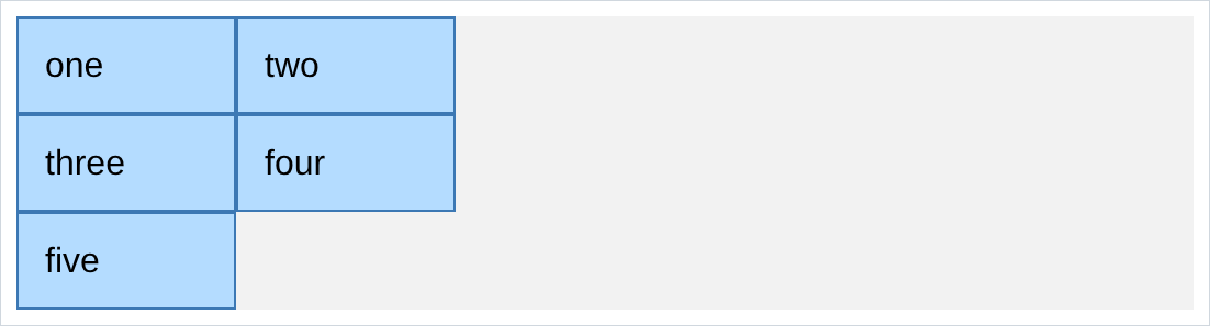
grid-template-columns: 100px 100pxmeans two columns, both 100px. the number of values is the number of columns.- the 5 children got dealt out left to right, top to bottom, and grid made a third row when it ran out.
- u never said how many rows. u say the columns and the rows happen.
- the grey area is the container, so u can see where it ends.
2. column-gap and row-gap
spacing between the cells, without touching the cells:
/* styles.css */
.grid {
  display: grid;
  grid-template-columns: 100px 100px;
  column-gap: 20px;
  row-gap: 40px;
}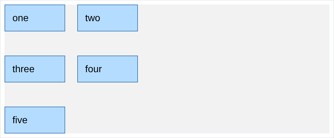
- gaps go between cells only. no margin on the children, no stray gap hanging off the right edge.
gap: 20px 40pxis the shorthand, row then column.gap: 20pxsets both.- in chapter 7 this was
margin-righton every cell, plus removing it from the last one in each row.
3. fr, sharing what is left
100pxcolumns do not resize.frdoes. 1fr means one share of whatever space is left over:
/* styles.css */
.grid {
  display: grid;
  grid-template-columns: 1fr 1fr;
  column-gap: 20px;
  row-gap: 20px;
}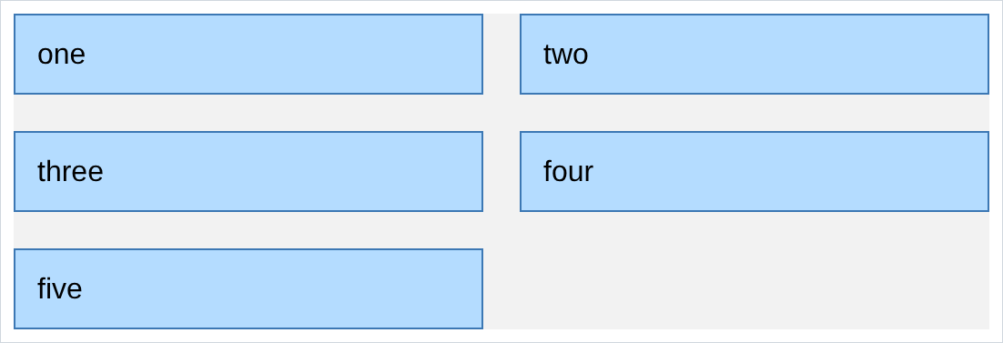
the numbers are shares, not sizes.
1fr 2frgives the second column twice as much:
grid-template-columns: 1fr 2fr;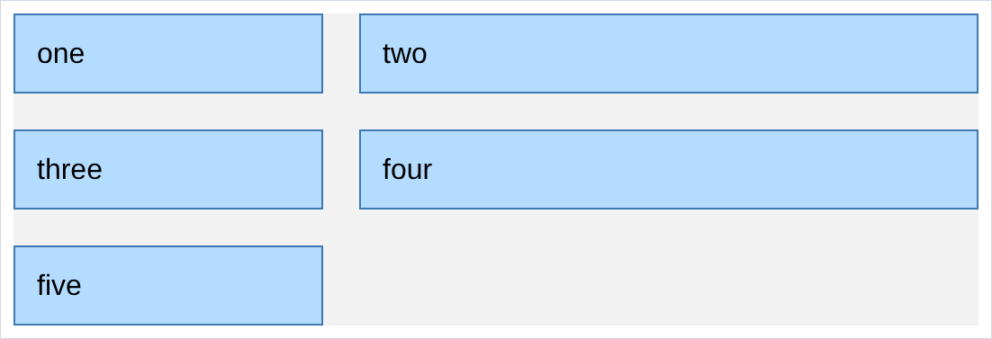
1fr 1fr 1fris thirds,1fr 3fris a quarter and three quarters. no calculator.- the gaps come out first. the columns share what is left after the gaps, which is why
1fr 1frlines up and50% 50%does not. frcolumns resize with the window for free, so half of chapter 11 is done before u get there.
4. mixing px and fr
u can use both in the same line, and this is the pattern u will use most:
/* styles.css */
.grid {
  display: grid;
  grid-template-columns: 100px 1fr;
  column-gap: 20px;
  row-gap: 20px;
}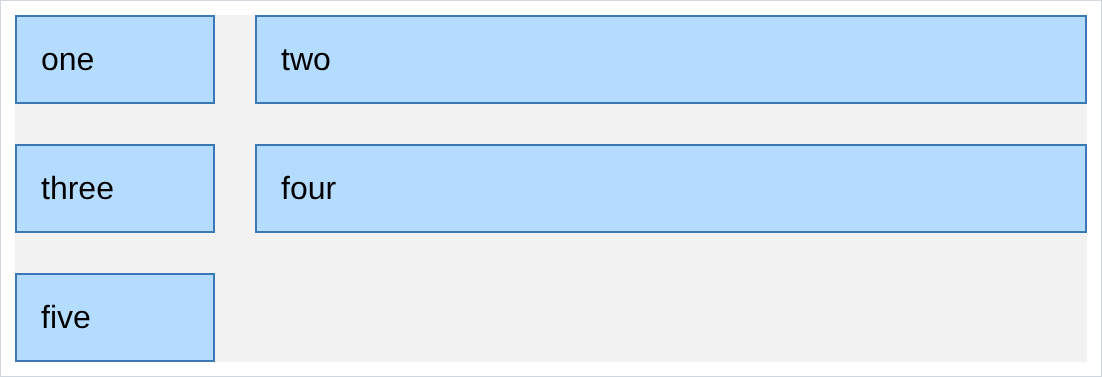
- the first column is exactly 100px whatever happens, the second takes everything else.
- that is a sidebar, an avatar next to text, an icon next to a label. ur own Youtube.html uses
50px 1frto put the channel picture in a fixed column and let the title take the rest. fris the only unit that means “the rest”.100%does not, and mixing100pxwith100%overflows.
5. justify-content
when the columns do not fill the container, this decides where the spare room goes. these are two 100px columns in a wide container:
justify-content: center;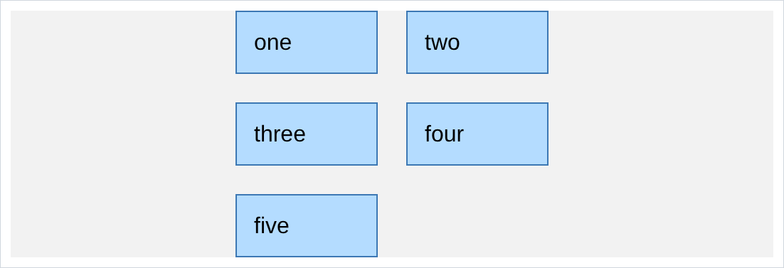
justify-content: space-between;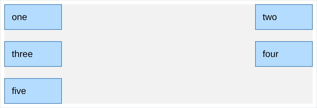
- other values worth knowing:
start,end,space-around,space-evenly. - it does nothing at all if ur columns are
fr, because then there is no spare room to move around. that is the most common reason this property “does not work”.
6. align-items
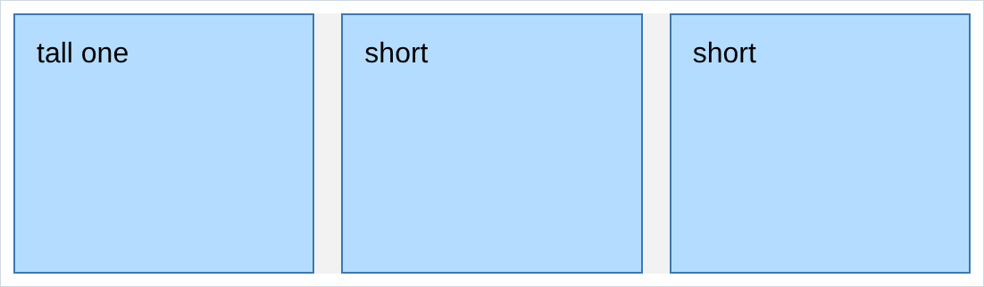
justify-contentwas horizontal.align-itemsis vertical, and it decides what a short cell does in a tall row. by default every cell stretches to the height of the tallest one in its row:
align-items: center;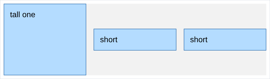
- the default is
stretch, and it is usually what u want: it makes a row of cards end at the same line even when one has more text. center,startandendare the others.justifyis across,alignis down. i still say that in my head every time.
7. a grid with one column
a grid does not have to be a grid:
/* styles.css */
.grid {
  display: grid;
  grid-template-columns: 1fr;
  row-gap: 10px;
}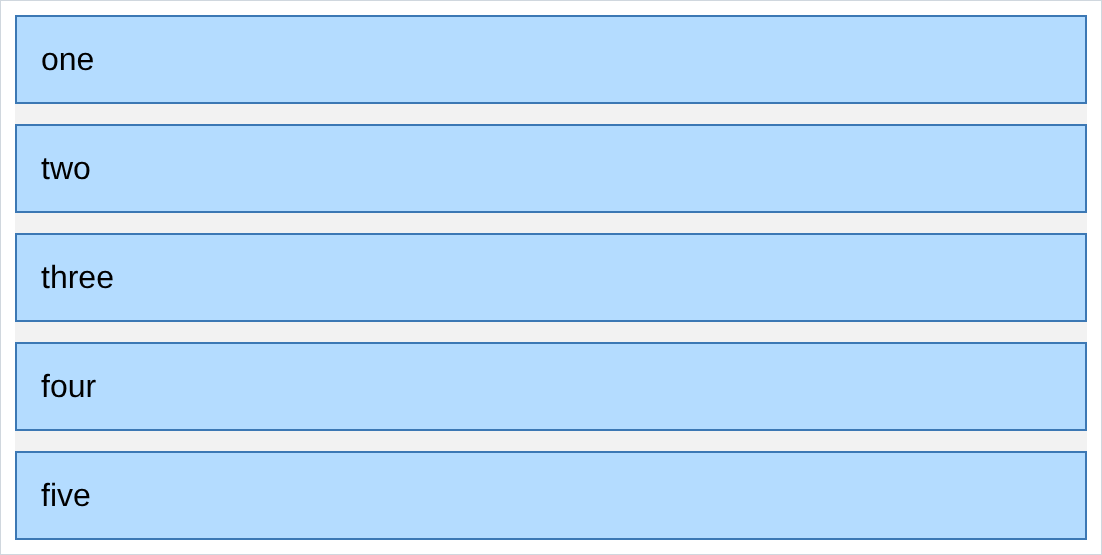
- one column is a vertical layout, spaced by
row-gapwith no margin anywhere. - so both halves of chapter 7’s nested layouts can be grid: one column for vertical, several for horizontal.
- and this is what a media query changes. 3 columns on a laptop, 1 on a phone, one line of css.
8. how it wraps
the grid never runs out of room sideways, because it only ever makes as many columns as u told it to:
grid-template-columns: 1fr 1fr 1fr;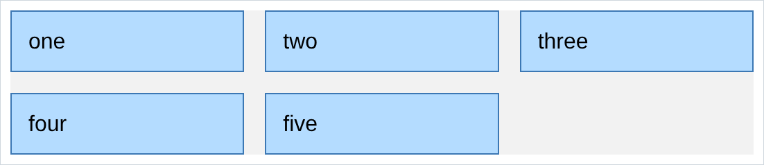
- 5 items into 3 columns is 3 then 2. the short last row does not stretch to fill itself, which is what u want.
- add a 6th and it lands in the gap. u change nothing.
- this is why a video grid is a grid and not a flexbox. the number of items is whatever came out of the database, and the layout does not care.
NOTES
-
devtools has a grid inspector. Inspect the container and click the little
gridbadge beside it. chrome draws the column and row lines over the page with their sizes. it is the fastest way to understand any grid, including someone else’s. -
grid-template-rowsexists too and sets explicit row heights. u will use it far less than the columns one, because letting rows size themselves is nearly always right. -
repeat(3, 1fr)is shorthand for1fr 1fr 1fr. it starts to matter around 6 columns. -
minmax()andauto-fitmake a grid that changes its own column count as the window resizes, with no media query at all:
grid-template-columns: repeat(auto-fit, minmax(200px, 1fr));“as many columns as fit, each at least 200px”. not in the reference pdf. look it up once the basics are comfortable.
-
grid is 2 dimensional, flexbox is 1. grid does rows and columns at once. flexbox does one line of things. chapter 9 is the other half.
-
a gap is not a margin. gaps only go between cells, never on the outside edge. if u want space around the whole grid, that is padding on the container.
Assignment
the exercises in this chapter follow HTML & CSS Full Course by supersimple.dev.
- Put 5 boxes in a container and turn it into a grid with 2 columns of 100px.
- Count the rows u got without writing a single row rule.
- Put a 20px gap between the columns and a 40px gap between the rows.
- Change both columns to
1frand drag the window narrower. Compare that to what the 100px version did. - Make the second column twice as wide as the first.
- Make the first column exactly 80px and the second one take all the rest.
- Go back to two 100px columns and centre them in the container. Then push them apart to the two edges.
- Change one cell to be 120px tall, and make the short ones sit in the middle of the row instead of stretching.
- Make a one column grid with 10px between the rows, and no margin anywhere.
- Make a 3 column grid, then add a 6th and a 7th box without touching the css.
- Take the row of 3 cards u built in chapter 7 with
inline-blockand rebuild it as a grid. Then deletevertical-align, the margins, and the jammed together tags, and check it still looks right.
stuck, or done and want to check? the solutions are here
or see it finished: the assignment is running here, as a real page u can scroll, hover and drag narrower. the edit it button on it opens the same code in the playground.