Time to study: ~90 min You will learn: how every element is really a box with 4 layers, how to put space between things, and the one technique that most page layouts are built out of.


← Chapter 6 | back to HTML & CSS 101 | next: Chapter 8 →
here the page stops being a list of things and starts being a layout. everything before was “what does this element look like”. this is “where is it, and how far from the thing next to it”.
it is the longest chapter in the course. take it in two sittings: sections 1 to 6 are spacing, 7 to 12 are arrangement.
1. the box model
every element on a page is a rectangle, even the ones that do not look like one. and that rectangle has 4 layers, from the inside out:
+-------------------------------- margin ---------------------------------+
|                                                                         |
|   +============================ border ==========================+      |
|   |                                                              |      |
|   |   +---------------------- padding ---------------------+     |      |
|   |   |                                                    |     |      |
|   |   |                   the content                      |     |      |
|   |   |                                                    |     |      |
|   |   +----------------------------------------------------+     |      |
|   |                                                              |      |
|   +==============================================================+      |
|                                                                         |
+-------------------------------------------------------------------------+
here is that drawn by a real browser. blue is the page, the yellow is the element, the red ring is its border:
/* styles.css */
body { background-color: rgb(215, 235, 255); }
.box {
  background-color: rgb(255, 220, 130);
  width: 200px;
  margin: 30px;
  padding: 25px;
  border: 6px solid rgb(200, 60, 60);
}
<!-- index.html -->
<div class="box">the content</div>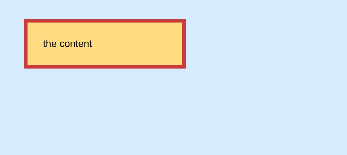
- margin is the blue gap outside the border. it pushes other things away.
- border is the red ring.
- padding is the yellow space inside, between the border and the words.
- padding gets the element’s background colour, margin does not. the yellow runs up to the red ring and outside it is blue. that is how u tell them apart on screen when something is wrong.
- these two answer nearly every “how do i move this a bit” question u will have.
2. margin, space on the outside
3 boxes with nothing between them:

and the same 3 with a margin on the right of each:
/* styles.css */
.box {
  width: 120px;
  display: inline-block;
  margin-right: 30px;
}
- 4 properties:
margin-top,margin-right,margin-bottom,margin-left. - margin pushes other elements away. it does not make the element bigger.
- a negative margin pulls instead:
.pulled { margin-left: -40px; }
- the pink box has climbed 40px onto the yellow one. a real tool, and also how u accidentally hide things under other things.
3. padding, space on the inside
/* styles.css */
.plain  { background-color: rgb(255, 220, 130); display: inline-block; }
.padded { background-color: rgb(255, 220, 130); display: inline-block; padding: 20px; }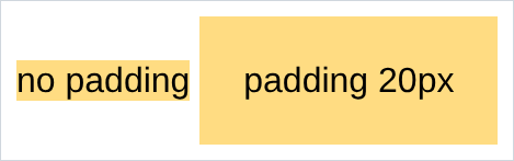
- same 4 properties:
padding-top,padding-right,padding-bottom,padding-left. - padding makes the element bigger. the coloured area grew, because padding is inside the background.
- negative padding does not exist. silently ignored, chapter 2 style. to pull something in, use a negative margin.
- the rule of thumb: padding for space inside a button or a card, margin for space between two of them.
4. border, and the shorthand
chapter 2 did the 3 separate properties. here is the shorthand that writes all 3 on one line:
border: 1px solid red;
/*      └┬┘ └─┬─┘ └┬┘
         │    │    └── colour
         │    └─────── style
└──────────── width */- the order does not matter to the browser, but everyone writes width, style, colour.
border: noneremoves it, which u already used on every button.- there is a per side version:
border-bottom: 1px solid #e5e7ebdraws a line under a header without boxing it in. ur own Youtube.html uses that on.header-container. - a border adds to the size, like padding. a 100px box with a 5px border each side takes 110px. note 4 is the switch that turns that off.
5. the 1, 2 and 4 value shorthands
marginandpaddingboth take a shorthand, and how many values u give it changes what they mean:
padding: 20px;                  /* all 4 sides */
padding: 10px 40px;             /* top and bottom, then left and right */
padding: 5px 10px 30px 60px;    /* top, right, bottom, left. clockwise from the top */
- the 4 value version goes clockwise from the top: top, right, bottom, left. everyone remembers it as TRouBLe.
- a 3 value version exists and nobody writes it on purpose.
marginworks the same way.margin: 0 autocentres a block element in its container, which is whattext-align: centerin chapter 6 could not do. it only works on an element that has a width.
6. the reset everyone writes first
the browser puts margin on things without asking. here are two paragraphs, untouched:
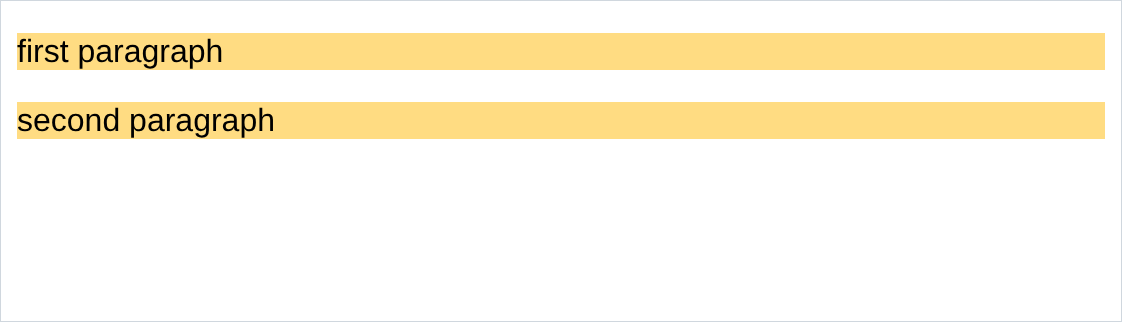
look at the white strip around the outside. that is
<body>, which comes with 8px of margin on all 4 sides. and the gap between the two yellow blocks is the default margin on<p>.
/* styles.css */
body {
  margin: 0;
}
p {
  margin-top: 0;
  margin-bottom: 0;
}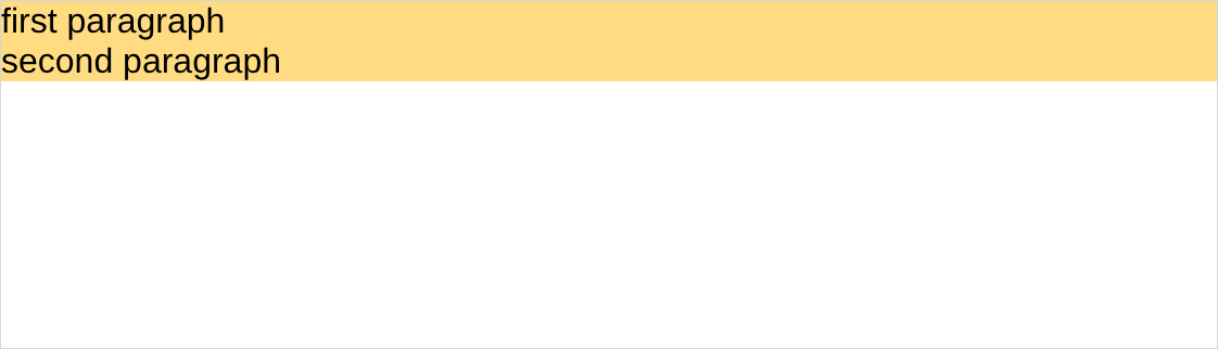
- both gaps are gone, and now u put space back where u want it.
- this is the first thing in nearly every real stylesheet, including the first 6 lines of ur own
Youtube.html. - then u space deliberately:
margin-bottom: 16pxon a title,4pxon the line under it. that is a decision. the browser’s 16px everywhere is not.
7. display: block
every element already has a
display.<p>and<div>areblock:
/* styles.css */
div {
  display: block;
}
- a block element takes the whole line, however little is in it.
- it fills the width of its container, which is why the black paragraph in chapter 2’s solutions stretched across the page.
widthandheightwork on it.- so block is how u stack things vertically, and it needs no css, because it is already the default.
8. display: inline-block
the same 3 divs with one word changed:
/* styles.css */
div {
  display: inline-block;
}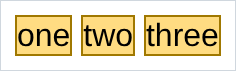
- it takes only the room it needs, and the next one sits beside it.
width,height,marginandpaddingall work. that is the “block” half of the name.- so inline-block puts things side by side with only what u know so far. chapters 8 and 9 are the two better ways.
9. display: inline
the third one is what
<span>,<a>and<strong>already are:
/* styles.css */
span {
  display: inline;
  width: 300px;
  height: 200px;
}
- the css says 300px and the page says otherwise. an inline element ignores
widthandheightcompletely, and mostly ignores top and bottom margin too. - that is the definition, not a bug. an inline element lives inside a line of text, and the line decides its own height.
- this is the answer to “why is my width not working”, and why that answer is so often “because it is a
<span>, make it inline-block”.
block          takes the whole line.        width and height work.
inline-block   takes only what it needs.    width and height work.
inline         flows inside a line of text. width and height are IGNORED.
10. <div>, the container
<div>is an element that means nothing and looks like nothing. it is a box u put other things in:
/* styles.css */
.container {
  display: inline-block;
  width: 200px;
  border: 1px solid rgb(160, 160, 160);
  padding: 10px;
  margin-right: 10px;
}
<!-- index.html -->
<div class="container">
<p>Name</p>
<input type="text">
</div>
<div class="container">
<p>Quantity</p>
<div>
<button>1</button>
<button>2</button>
</div>
<button>Submit</button>
</div>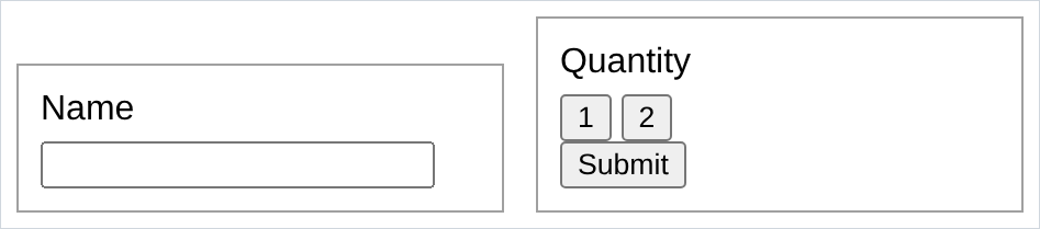
- the two panels moved as units. that is what a div buys u: one handle for a group of things.
- divs go inside divs, as deep as u need. the second panel has one holding its two number buttons.
- div is block, span is inline. that is the only real difference between them.
- the two panels line up along their bottoms, not their tops. that is inline-block sitting on the text baseline.
vertical-align: topis the fix, in note 1.
11. the nested layouts technique
this is the idea the whole reference pdf builds towards, and it is simpler than it sounds. there are only 2 kinds of layout:
vertical layout                 horizontal layout

+-------------------+           +------+ +------+ +------+
|                   |           |      | |      | |      |
+-------------------+           |      | |      | |      |
+-------------------+           |      | |      | |      |
|                   |           +------+ +------+ +------+
+-------------------+
+-------------------+
|                   |
+-------------------+
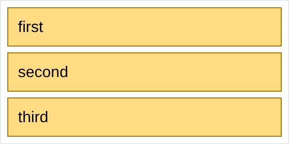
a vertical layout is
display: blockdivs, which is free because that is the default:
a horizontal layout is
display: inline-blockdivs:

and then u put one inside the other. here is a horizontal layout of 3 cards, and each card is a vertical layout of 3 lines:
/* styles.css */
.card {
  display: inline-block;
  vertical-align: top;
  width: 150px;
  margin-right: 10px;
  border: 1px solid rgb(60, 120, 180);
  padding: 8px;
}
.card p { margin-top: 0; margin-bottom: 6px; }
- horizontal outside, vertical inside. that is the entire trick.
- every layout u have seen is this, repeated. a youtube page is a vertical stack (header, then content), the content is horizontal (sidebar, then videos), the videos are a horizontal row of cards, and each card is a vertical stack of thumbnail, title, channel.
- so when a layout looks impossible, do not ask “which property does this”. ask “is this row horizontal or vertical, and what is inside each cell”, and draw it on paper.
inline-blockis the worst of the 3 ways to do the horizontal half, and the only one u know yet. chapter 8 and chapter 9 are the others.
12. inline styles
the third and last place css can live: an attribute on the element itself.
<!-- index.html -->
<div style="background-color: red; color: white; padding: 10px; width: 200px;">
  styled with no selector at all
</div>
- no selector, because there is nothing to select. it applies to that one element.
- it beats every rule in ur stylesheet. one day u will change a colour in
styles.css, see nothing happen, and it will be astyle="..."u forgot about. - so do not build pages with it. know it because u will read other people’s html, because devtools writes it when u drag things, and because it is handy for a 10 second test.
NOTES
-
vertical-align: top. inline-block elements line up along the bottom of their text by default, which looks broken the moment two of them have different heights.vertical-align: topon all of them fixes it. u will want this every single time u use inline-block. -
inline-block has a whitespace gap, and it is not a bug. a newline between two inline-block divs is a space, and a space between inline things shows. so u get a mystery 4px gap. every workaround is ugly, and the real fix is the next two chapters. the section 11 examples have their tags jammed together (
</div><div>) for this reason. -
margins collapse. a
margin-bottom: 20pxabove amargin-top: 30pxgives u 30px, not 50. the bigger one wins. it only happens vertically between block elements, and it is why people pick one direction, usuallymargin-bottom, and stick to it. -
box-sizing: border-boxmakeswidthmean the whole box, padding and border included, which is what u assumed it meant. nearly every real project starts with:
* {
  box-sizing: border-box;
}
*selects every element. not in the reference pdf, worth knowing anyway.
-
display: noneremoves an element completely. no space, nothing. it is different fromopacity: 0andvisibility: hidden, which both leave the gap where the element was. -
devtools draws this chapter for u. Inspect an element and the bottom of the Styles panel shows the box model with the real numbers, colour coded. when a gap is the wrong size, it tells u which of the 4 layers is doing it in about 3 seconds.
Assignment
the exercises in this chapter follow HTML & CSS Full Course by supersimple.dev, and continue through display, the div element and nested layouts.
- Make a div with a background colour, 200px wide, and give it margin, padding and a border. Then Inspect it and find all 4 layers in the devtools box model panel.
- Work out, from ur own page, which of margin and padding gets the background colour. Do not look it up, look at it.
- Put 3 boxes side by side with a 30px gap between them.
- Pull the middle one 40px to the left with a negative margin.
- Write the same padding 3 ways: 1 value, 2 values, 4 values.
- Set the body margin to 0 and kill the top and bottom margin on every
<p>. - Put a block, an inline-block and an inline element on a page and describe in one sentence each how they behave differently.
- Set
width: 300pxon an inline element and reload. Explain why nothing happened. - Group a label and a text box inside a div, then make 2 of those groups sit side by side.
- Fix the alignment when one of the 2 groups is taller than the other.
- Build a vertical layout of 3 rows.
- Build a horizontal layout of 3 columns.
- Now build a horizontal layout of 3 cards, where each card is a vertical layout of a title and 2 lines.
- Centre a 300px wide box in the middle of the page using only margin.
- Style one element with an inline
style="...", then try to overrule it fromstyles.cssand see what wins.
stuck, or done and want to check? the solutions are here
or see it finished: the assignment is running here, as a real page u can scroll, hover and drag narrower. the edit it button on it opens the same code in the playground.