Time to study: ~90 min You will learn: the other way to put things in a row, how to make one element eat the leftover space, and why everything reverses the moment u switch to a column.


← Chapter 8 | back to HTML & CSS 101 | next: Chapter 10 →
grid says “here are my columns, deal the children into them”. flexbox says “here is a line of things, share the space between them”.
in practice: a page of cards is grid, a toolbar is flexbox. u will use both, often nested inside each other.
1. display: flex
same as grid, the property goes on the container:
/* styles.css */
.flexbox {
  display: flex;
}
<!-- index.html -->
<div class="flexbox">
<div class="item">one</div>
<div class="item">two</div>
<div class="item">three</div>
</div>
- one line, and the divs are in a row. a second ago they were
display: blockand stacked. flex-direction: rowis the default, so u almost never write it.- each item is only as wide as it needs, and there is no whitespace gap. the chapter 7 inline-block problem is gone, same as grid.
- the grey container still stretches full width even though the items do not.
2. justify-content, along the row
the leftover space in the container has to go somewhere, and this decides where:
justify-content: center;
justify-content: space-between;
space-betweenputs the leftover space between the items, so the first and last touch the edges. that is a header: logo left, account right, nothing in the css about how far apart.- the set:
flex-start(default),flex-end,center,space-between,space-around,space-evenly. - it only does something if there is leftover space. give an item
flex: 1and there is none, and this looks broken.
3. align-items, across the row
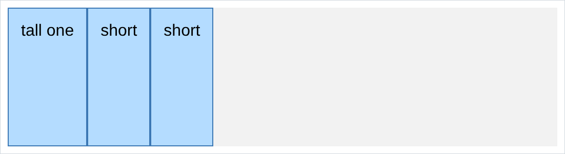
justify-contentmoved things along the row.align-itemsmoves them across it. by default every item stretches to the height of the tallest:
align-items: center;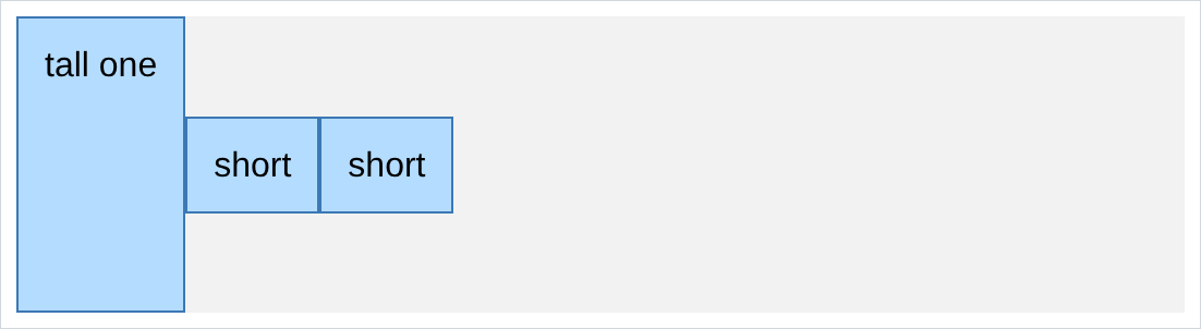
stretchis the default.center,flex-start,flex-endandbaselineare the others.display: flexplusalign-items: centervertically centres something next to something else. an icon beside a label, a picture beside a name. learn it as a pair, because before flexbox this was genuinely hard.- the reference pdf lists
align-items: space-between. that value does not exist. i rendered a page with it and one without and compared: zero differing pixels. it is a dead line, chapter 2 style. the one that spreads things out isjustify-content.
4. flex: 1, taking what is left
this is the one u will use most, and grid has no direct equivalent. it goes on a child, not the container:
/* styles.css */
.grow {
  flex: 1;
}
- the middle item took everything the other two did not need. no width, no percentage, no arithmetic.
- it stays right when the window resizes or the other two change, because it is defined as “the rest” and not as a number.
- that is the search bar in every app u use: 2 fixed groups, one stretchy thing between them.
5. sharing with flex: 1 and flex: 2
the number is a share, exactly like
frin chapter 8:
/* styles.css */
.a { width: 100px; }
.b { flex: 1; }
.c { flex: 2; }
- the 100px is taken out first. what is left splits into 3, and
.cgets 2 of them. flex: 1on every child gives equal columns, the flexbox version of1fr 1fr 1fr.- want a starting width and stretch? put
flex: 1and awidthon the same element. the width is the starting point,flexshares the leftovers.
6. flex-shrink: 0, and things that must not squash
when there is not enough room, flexbox shrinks things. here is a 60px icon next to a long piece of text, in a container too narrow for both:
/* styles.css */
.flexbox { display: flex; width: 340px; }
.icon { width: 60px; height: 60px; }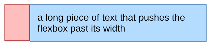
the icon is not 60px any more. flexbox took the space it needed from everything that would give it up.
flex-shrink: 0says “not this one”:
.icon {
  width: 60px;
  height: 60px;
  flex-shrink: 0;
}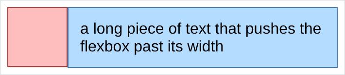
- this is the most confusing thing about flexbox the first time. u set a width, u can see it in ur css, and the element is not that width.
widthin a flexbox is a suggestion, and shrinking is on by default. - so anything that must keep its size, an icon, an avatar, a logo, gets
flex-shrink: 0. ur own Youtube.html has it on.voice-buttonand.header-right. - the opposite problem is an item that refuses to shrink, usually a long word or an
<input>with a built in width. the fix iswidth: 0next toflex: 1: start from nothing and grow into whatever is left. it looks wrong and it is correct.
7. flex-direction: column
/* styles.css */
.flexbox {
  display: flex;
  flex-direction: column;
}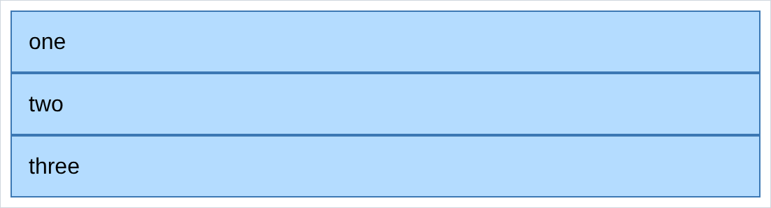
- same container, one word, and the row is a column.
- so flexbox does both halves of the nested layouts technique, same as grid.
8. what flips when u go column
this is the part that catches everyone.
justify-contentandalign-itemsare not “horizontal” and “vertical”. they are “along the direction” and “across the direction”, and the direction just changed.
flex-direction: column;
justify-content: space-between;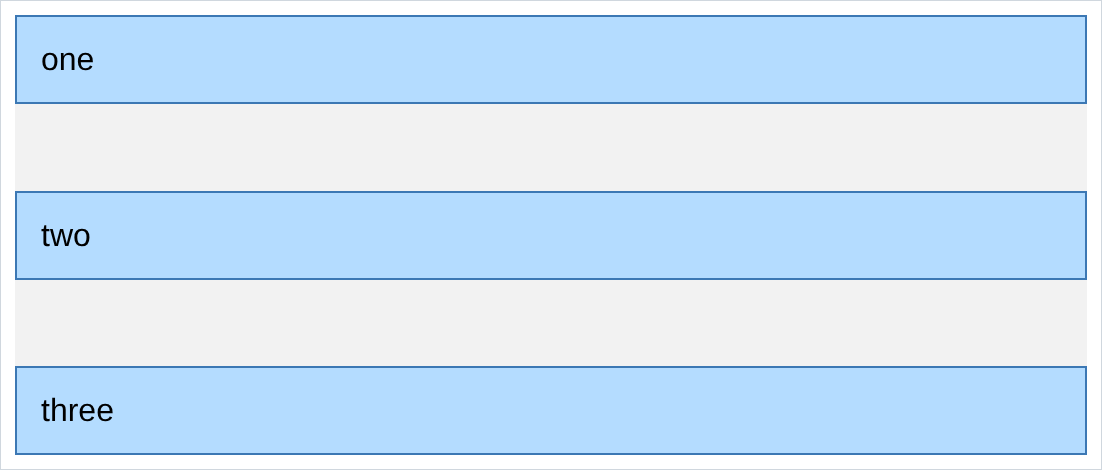
flex-direction: column;
align-items: center;
- in a row:
justify-contentis horizontal,align-itemsis vertical. - in a column: they swap.
- so the same 2 words do opposite things depending on one other line, and u will get it backwards. do not memorise it, just try the other one. it takes 2 seconds in devtools.
justify-contentin a column does nothing unless the container has aheight. a row is full width by default so there is always spare space. a column is only as tall as its contents, so there is none. the example above hasheight: 220px.
9. flexbox inside flexbox
this is how real headers are built, and it is 3 flexboxes:
/* styles.css */
.header {
  display: flex;
  justify-content: space-between;
  align-items: center;
  height: 50px;
}
.header-left, .header-right {
  display: flex;
  align-items: center;
  flex-shrink: 0;
}
.search-container {
  display: flex;
  flex: 1;
  max-width: 300px;
}
.search-bar {
  flex: 1;
  width: 0;
}
<!-- index.html -->
<div class="header">
<div class="header-left"> ... </div>
<div class="search-container"> ... </div>
<div class="header-right"> ... </div>
</div>
- the outer flexbox has 3 children, not 7. left group, search, right group. that is the whole trick.
- each group is its own flexbox laying out its own contents, with no idea what the others are doing.
flex-shrink: 0on the side groups makes the search bar the only thing that gives way when the window narrows. one line, deliberate.flex: 1says grow,max-width: 300pxsays but not past here.- this is ur
Youtube.htmlheader, almost exactly.
10. grid or flexbox
u now have 2 tools that both put things in a row, and the honest answer is that either will usually work. but there is a rule of thumb that is right most of the time:
flexbox   one line of things, sizes decided by the content.
          a header, a toolbar, an icon next to a label, a row of buttons.

grid      a repeating structure, sizes decided by u.
          a page of cards, a photo wall, a form of label/field pairs.
- flexbox is 1 dimensional, grid is 2. flexbox lays out a line. grid lays out rows and columns at once and lines them up with each other.
- the giveaway question: do things need to line up with the row above? if yes, grid. a toolbar is flexbox because there is no row above it.
- nesting them is normal, not a compromise. ur
Youtube.htmlis a grid of videos, each info block another grid, and the header a flexbox. that is a well built page.
NOTES
-
gapworks in flexbox too. it did not always, which is why older code putsmargin-righton every child.gapon the container is better in every way. -
flex: 1is shorthand forflex-grow: 1; flex-shrink: 1; flex-basis: 0%. u will see the 3 written out separately in other people’s code.flex: 1is what u should write. -
flex-wrap: wraplets items drop onto a new line when they run out of room, instead of shrinking forever. without it a flexbox row never wraps, which is the other half of why long things get squashed. -
devtools has a flexbox inspector, same as grid: a
flexbadge beside the container. it draws the items and the free space, which makesjustify-contentobvious in a way reading never will. -
align-selfoverridesalign-itemsfor a single child. useful when one thing in a row needs to sit at the top and everything else is centred. -
margin-left: autoon a flex child pushes it and everything after it to the far end. it is the quick way to say “this one goes on the right” without restructuring into groups.
Assignment
the exercises in this chapter follow HTML & CSS Full Course by supersimple.dev, and the nesting part follows the same course at 4:15:21.
- Put 3 boxes in a container and turn it into a flexbox.
- Centre them in the container, then push them to the two edges instead.
- Make one box 110px tall, and centre the other two against it.
- Make the middle box take all the space the other two do not need.
- Give the first box a width of 100px, the second
flex: 1and the thirdflex: 2. Work out from the result what the numbers mean. - Make a 60px square next to a long paragraph, in a container 340px wide. Look at the square and measure it in devtools.
- Now stop it shrinking, and say in one sentence why it was shrinking.
- Turn the flexbox into a column.
- Give the column a height of 220px and spread the 3 boxes from top to bottom.
- Now centre them horizontally instead, and note which property u used and which one u used in task 2.
- Build a header: a group of 2 things on the left, a group of 2 on the right, and a search box in the middle that grows and shrinks. The 2 side groups must never squash.
- Take the row of cards from chapter 8 and rebuild it with flexbox. Then decide which of the 2 versions u would keep, and why.
stuck, or done and want to check? the solutions are here
or see it finished: the assignment is running here, as a real page u can scroll, hover and drag narrower. the edit it button on it opens the same code in the playground.