Time to study: ~75 min You will learn: how to make something stick to the screen while the page scrolls, how to put a badge in the corner of a card, and the one line everybody forgets that makes the second one work.


← Chapter 9 | back to HTML & CSS 101 | next: Chapter 11 →
grid and flexbox arrange things in the flow: everything gets its own space and nothing overlaps.
positionsteps outside that, for the 2 jobs the flow cannot do:
- something that stays put while the page scrolls, like a header
- something that sits on top of something else, like a duration badge on a thumbnail
the scrolled screenshots below really were scrolled before the picture was taken.
1. position: static, the default
every element already has a position, and it is
static:
/* styles.css */
.bar {
  position: static;
  width: 200px;
}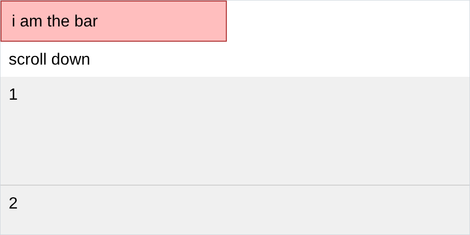
staticmeans “sit where the flow puts u”. everything has been doing it for 9 chapters.top,right,bottomandleftdo nothing on a static element, which is why ur first attempt at moving something will not move.- so
positionis really the switch that turns those 4 properties on.
2. position: fixed
/* styles.css */
.bar {
  position: fixed;
  top: 0;
  left: 0;
  width: 200px;
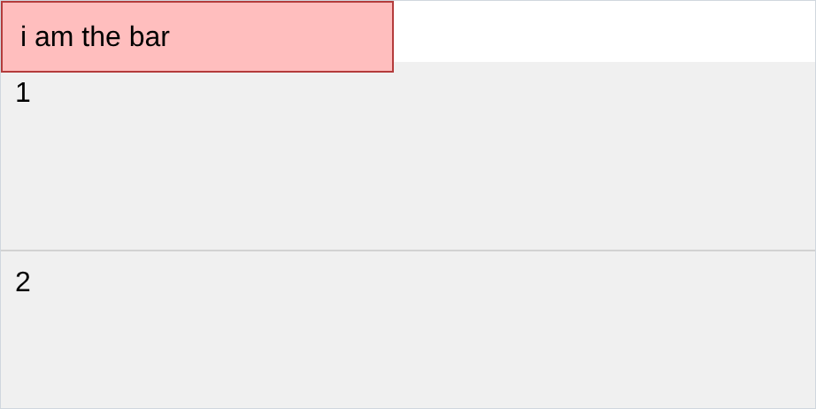
}
and here is the same page, actually scrolled down to the bottom:
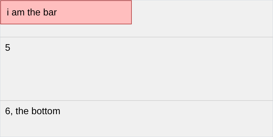
- fixed positions the element against the browser window, not the page. the page moved and the bar did not.
- that is a sticky header, a cookie banner, a chat bubble in the corner.
- compare the first screenshot with section 1’s: the bar is now on top of the words instead of above them. a fixed element is out of the flow, so nothing knows it exists and nothing makes room for it. u make that room urself, usually with padding on whatever is underneath.
3. top, right, bottom and left
those 4 say how far from each edge:
top: 0;          /* 0px from the top of the window */
bottom: 10px;    /* 10px up from the bottom */
left: 50px;      /* 50px in from the left */
right: 100px; /* 100px in from the right */- usually u set 2, one vertical and one horizontal.
top: 10px; right: 10pxis the top right corner. - negative values push it off the edge, which is how u half hide something on purpose.
- setting none is fine. a fixed element with no offsets stays where it was, just out of the flow.
4. setting opposite sides stretches
this is the bit that is not obvious. if u set both
topandbottom, the element stretches to reach both:
/* styles.css */
.strip {
  position: fixed;
  top: 0;
  bottom: 0;
  left: 0;
  width: 70px;
}
.corner {
  position: fixed;
  top: 10px;
  right: 10px;
}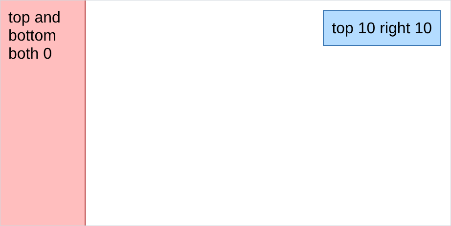
- the pink strip has no
heightand it is full height, becausetop: 0andbottom: 0together mean “reach both edges”. same withleftandrightfor width. - so there are 2 ways to size a positioned element: give it a
width/height, or pin 2 opposite sides. the second resizes with the window, the first does not. - that strip is the youtube sidebar. ur own Youtube.html has
top: 50px; bottom: 0px; left: 0px; width: 70pxon.side-container: fixed width, full remaining height, starting under the 50px header.
5. position: absolute
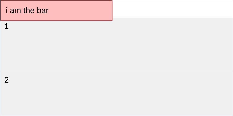
absolutelooks identical tofixeduntil u scroll:
/* styles.css */
.bar {
  position: absolute;
  top: 0;
  left: 0;
}
and scrolled down:
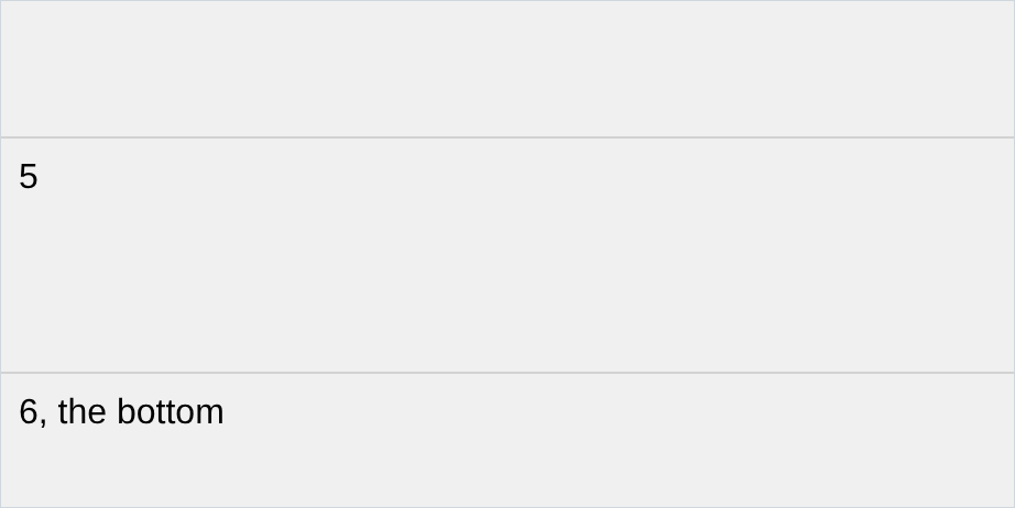
- it scrolled away. absolute positions against the page, fixed against the window. that is the entire difference, and it only shows up when u scroll.
- both are out of the flow, both use the same 4 offsets.
- absolute on its own is not very useful. section 7 is what makes it the most used of the 3.
6. position: relative
relativeis the odd one. the element stays in the flow, in its normal spot, and then u nudge it:
/* styles.css */
.nudged {
  position: relative;
  top: 10px;
  left: 40px;
}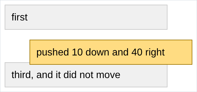
- the yellow box moved 10 down and 40 right, and the boxes around it did not move. the gap it left is still there.
- that is the difference from margin: margin pushes everything else, relative moves only this element and leaves its hole behind.
- nudging like this is the small half of what
relativeis for. the next section is the big half.
7. absolute inside relative
this is the most useful thing in the chapter. an absolute element normally positions against the page. but if any ancestor has a position that is not
static, it positions against that instead:
/* styles.css */
.card {
  position: relative;    /* <- the whole trick is this line */
  width: 260px;
  height: 120px;
}
.badge {
  position: absolute;
  bottom: 6px;
  right: 6px;
}
<!-- index.html -->
<div class="card">
a card, with a badge stuck in its bottom right corner
<div class="badge">14:20</div>
</div>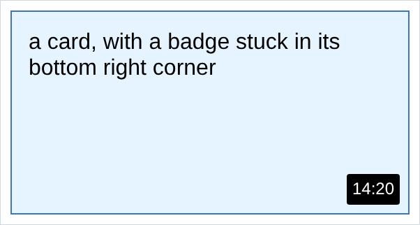
now delete one line,
position: relative, and change nothing else:
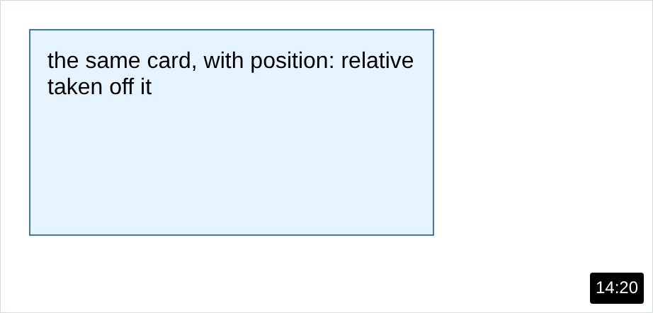
- the badge shot to the corner of the page, because with no positioned ancestor that is what “bottom right” means.
- the rule:
position: relativeon the parent,position: absoluteon the child. the parent does not move, it just becomes the thing the child measures from. - the parent does not have to be
relative. anything exceptstaticworks. u userelativebecause it is the only one that does not disturb the layout. - this is a duration badge, a close button on a dialog, a notification dot on an icon, a SALE flash on a product photo. once u see it, u see it everywhere.
- ur Youtube.html does it:
.video-thumbnail-rowis relative and.video-timeis absolute in its corner.
8. z-index
when things overlap, this decides which one is in front:
/* styles.css */
.a { position: absolute; z-index: 2; }
.b { position: absolute; z-index: 1; }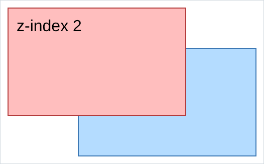
- higher is in front. the default is
0. z-indexdoes nothing on aposition: staticelement. it needs a position first, and it fails silently like everything else.- with equal
z-index, the one written later in the html wins. so sometimes the fix is moving the element down the file and not touching the css. - do not start at 1 and climb. u end up with
z-index: 99999and no memory of what it was fighting. urYoutube.htmluses exactly one, and that is a healthy amount.
NOTES
-
position: stickyis the 5th one. it behaves likerelativeuntil u scroll past it, then likefixed, sosticky; top: 0keeps a table heading visible while its rows scroll under it. it needs the parent to have room to scroll, which is the usual reason it seems not to work. -
a fixed header hides the top of ur page. the fix is padding on the content equal to the header’s height. ur
Youtube.htmlhaspadding-top: 80pxon the video grid for a 50px header, which is the header plus a bit of breathing room. -
top: 50%is 50% of the container, not the element, so it puts the element’s top edge in the middle and looks off centre. centring this way needstransform: translate(-50%, -50%)as well. use flexbox instead. -
an absolute element shrinks to fit its content unless u give it a width or pin 2 opposite sides. that surprises u the first time a full width bar comes out 40px wide.
-
position: fixedon a phone is fiddly, because the address bar appears and disappears as u scroll. it works, it is just never quite as still as u expect. -
devtools shows u the offsets. Inspect a positioned element and the Styles panel lists
top,leftand friends with the computed pixel values, which is how u find out that urright: 10pxis being measured from the wrong parent.
Assignment
the exercises in this chapter follow HTML & CSS Full Course by supersimple.dev, and the absolute and relative combinations follow the same course at 5:07:14.
- Make a page tall enough to scroll, with a coloured bar at the top of it.
- Try to move the bar with
top: 20pxbefore u touchposition. Note what happens. - Make the bar
position: fixedat the top left, then scroll to the bottom. - Look at what happened to the text that used to sit under the bar, and explain it in one sentence.
- Change
fixedtoabsolute, scroll again, and say what the difference is. - Make a strip 70px wide that runs the full height of the window, using no
heightat all. - Put a box in the top right corner, 10px from each edge.
- Take 3 stacked boxes and push the middle one 10px down and 40px right, without moving the other two.
- Build a card with a small black badge pinned to its bottom right corner.
- Delete
position: relativefrom the card and reload. Write down where the badge went and why. - Make 2 boxes overlap, and swap which one is in front twice: once with
z-index, and once by changing nothing but the order of the html.
stuck, or done and want to check? the solutions are here
or see it finished: the assignment is running here, as a real page u can scroll, hover and drag narrower. the edit it button on it opens the same code in the playground.