Time to study: ~80 min You will learn: how to give a page different css at different screen widths, the selectors u have not met yet, and the rules that decide which of two conflicting styles actually wins.


← Chapter 10 | back to HTML & CSS 101 | next: Chapter 12 →
the last chapter before the project, and it is 3 things bolted together: making a page work on a phone, the selectors that are more than a class name, and the rules underneath everything u have written so far.
slow down on the third one. u have been relying on specificity since chapter 2 without a name for it.
1. what responsive means
ur page has to work on a 27 inch monitor and on a phone held in one hand. those are 2500px and 390px. the same layout cannot be right for both, and shrinking everything is not the answer, because then the text is 4px tall.
- so u write the page once and add a few blocks of css that only apply at certain widths.
- build the desktop version, then narrow the window until it breaks. where it breaks is where u need a media query. do not guess at device sizes, there are hundreds.
- most of the work is done already if u used
fr,%andflex: 1instead of fixed pixels. a layout built from shares mostly resizes itself, and media queries handle the last 20%.
2. @media, a block of css with a condition
a media query is a normal css rule with an
ifwrapped round it:
/* styles.css */
.grid {
  display: grid;
  grid-template-columns: 1fr 1fr 1fr;
  gap: 10px;
}

@media (max-width: 750px) {
  .grid { grid-template-columns: 1fr 1fr; }
}

@media (max-width: 500px) {
  .grid { grid-template-columns: 1fr; }
}
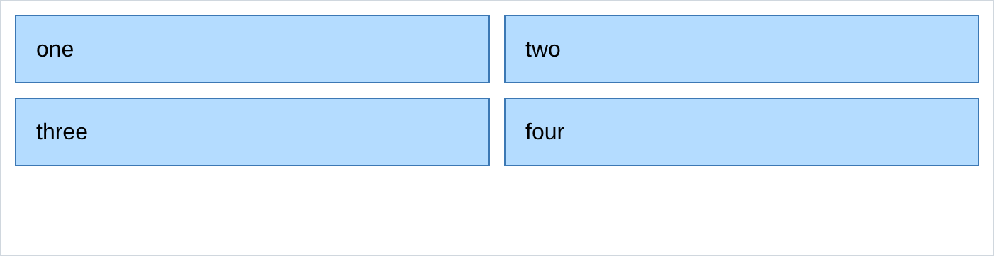
that is the whole responsive layout. here is the same file in a 900px window:

at 700px:
and at 420px:
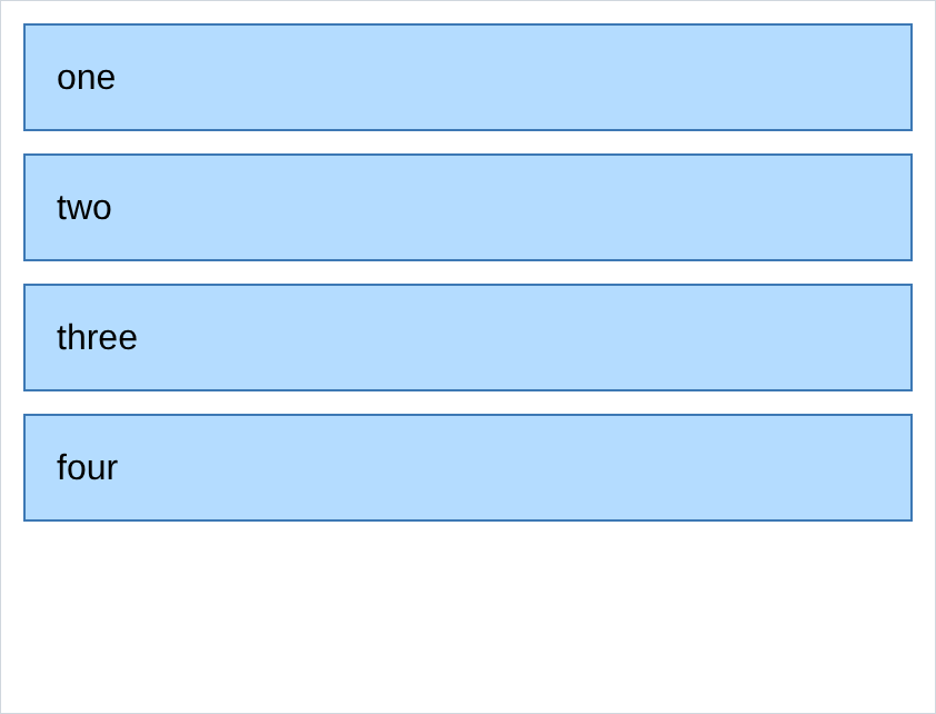
- same html, 3 layouts. the only thing that changed between those screenshots is the width of the window.
max-width: 750pxmeans “750px or less”.min-widthis the other way round.- the css inside is ordinary. anything u can write outside one u can write inside one.
- it goes after the rule it overwrites. put it above and it does nothing.
- ur own Youtube.html does exactly this: 3 columns normally, 4 above 1050px, 2 below 750px.
3. the ranges, and the .02 gap
when u want a band rather than an open end, u chain the conditions:
@media (max-width: 750px) {
  /* 0 to 750 */
}

@media (min-width: 750.02px) and (max-width: 1000px) {
  /* 750 to 1000 */
}

@media (min-width: 1000.02px) {
  /* 1000 and up */
}- why
.02and not1: a window can genuinely be 750.5px wide, on a scaled display or a zoomed page. withmax-width: 750pxandmin-width: 751px, a window at 750.5 matches neither, and u get a broken layout at one width u will never reproduce on purpose. .02is small enough that no real window lands in the gap.- if u only use
max-widthand let them overwrite each other, u need none of this. that is what section 2 does, and it is simpler.
4. selectors with a comma
a comma means “and also”. one rule, several targets:
/* styles.css */
.title, .subtitle, p {
  color: rgb(0, 100, 200);
}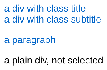
- the plain div is untouched, because it is not in the list. classes and element names mix freely.
- a missing comma changes the meaning completely instead of breaking.
.title .subtitleis section 5 and means something else entirely. a real bug, and silent.
5. selectors with a space
a space means “inside”.
.card pis every<p>that is somewhere inside an element with class card:
/* styles.css */
.card p {
  color: rgb(200, 40, 40);
  font-weight: bold;
}
<!-- index.html -->
<div class="card">
<p>inside the card, so it is red</p>
</div>
<div class="outside">
<p>outside the card, so it is not</p>
</div>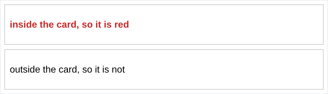
- this styles the contents of a component without giving every child a class. it is the difference between 3 classes and 15.
- it goes as deep as u like, and chains:
.sidebar .menu ais a link inside a menu inside a sidebar. - it combines with states:
.card:hover .tooltipis “the tooltip, but only while the mouse is on the card”. that is a tooltip with no javascript. no screenshot, same as every hover here. - ur
Youtube.htmluses it twice.
6. inheritance
some properties pass down into the elements inside:
/* styles.css */
body {
  font-family: Georgia;
  color: rgb(200, 40, 40);
}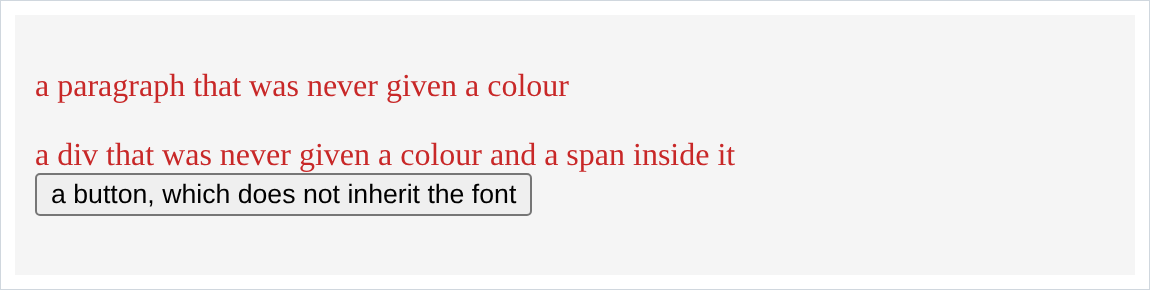
- the paragraph, the div and the span are all red Georgia, and none of them has a rule. they inherited from
<body>. - text properties inherit:
font-family,font-size,color,line-height,text-align. - box properties do not:
background-color,width,border,padding,margin. imagine ifborderinherited. - so setting the font once on
<body>really is all u need for the whole page. - look at the button. still Arial, still black. form controls do not inherit, because the operating system draws them.
font-family: inheritopts them back in, and yes, u have to remember that forever.
7. specificity
u have been living with this since chapter 2. when 2 rules set the same property on the same element, specificity decides which one wins:
/* styles.css */
body { color: black; }
p { color: red; }
.title { color: green; }
<!-- index.html -->
<p>a plain paragraph, red from the p rule</p>
<p class="title">a paragraph with class title</p>
<div>a div, black from the body</div>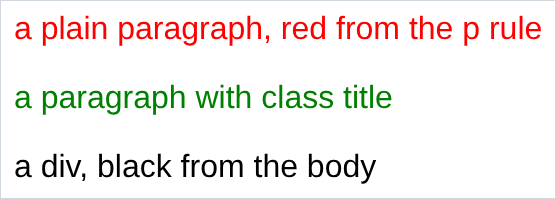
the second paragraph is hit by all 3 and it comes out green.
the order, weakest first:
inherited from a parent        weakest
element name        p, div, button
class               .title, .card
inline style        style="..."    strongest
- a more specific selector wins whatever the order.
.titlebeatspeven withpwritten last. - order only breaks ties between selectors of equal strength. the chapter 2 rule turns out to be the tie breaker, not the main rule.
- so when a style is spelled right and still not applying, something more specific is beating it. devtools shows u exactly what, loser struck through, winner at the top.
!importantbeats everything. u will meet it in other people’s code, and every one u write makes the next problem harder. know it, do not reach for it.- ids beat classes, which is why chapter 4 told u not to style with ids.
8. semantic elements
<header>,<nav>,<main>,<section>,<article>,<aside>,<footer>. they behave exactly like a<div>. i rendered a page with divs and the same page with these, and compared: zero differing pixels.
<!-- index.html -->
<header class="top">the top</header>
<nav class="menu">the menu</nav>
<main class="body-part">the main part</main>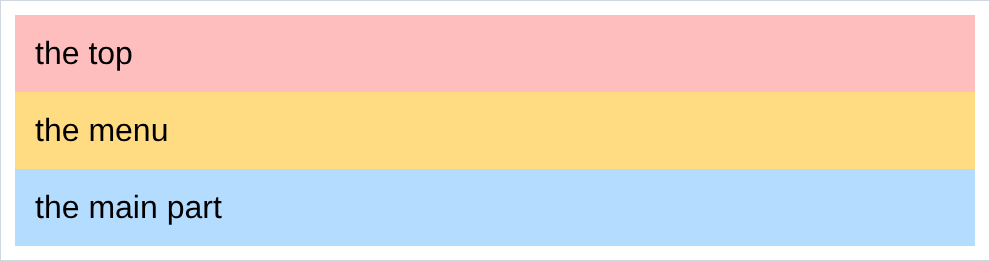
- so why bother: they tell other software what part of the page it is looking at. a screen reader can offer “skip to main content”. a search engine knows the
<nav>is navigation. reader mode knows what to keep. - it costs nothing. u were writing a
<div>anyway, so write<header>when it is a header. - use the semantic one when the name is honestly true,
<div>when it is just a box. a<section>that is not a section helps nobody.
9. comments
/* a css comment */<!-- an html comment -->- 2 languages, 2 syntaxes, and neither works in the other’s file.
<!-- -->inside a.cssfile breaks it. - the everyday use is not documentation, it is switching things off. comment out half a rule and reload to see which half was doing it. the fastest debugging tool u have that is not devtools.
- anyone can read them in the page source. nothing in there u would not say out loud.
10. pointer-events and white-space
two odd properties that solve 2 specific problems, both of which u will hit.
.tooltip {
  pointer-events: none;
  white-space: nowrap;
}
pointer-events: nonemakes an element invisible to the mouse. clicks and hovers pass straight through to whatever is behind. that is how u put a label over a photo without stopping the photo being clicked, and how u stop a tooltip flickering when the mouse touches the tooltip.white-space: nowrapstops text wrapping, ever. the same text in a 120px box, without and with:
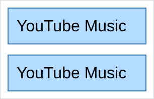
- the second is wider than its box. that is the trade: the text will not wrap, so something has to give. use it for a menu label or a date, never for a paragraph.
- ur Youtube.html has it on
.side-button, so “YouTube Music” stays on one line in a 70px sidebar.
NOTES
-
<meta name="viewport" content="width=device-width, initial-scale=1">in the<head>, or none of this works on a phone. without it a phone pretends to be 980px wide and zooms the page out, so ur media queries never fire. it was note 3 of chapter 5, and this is where forgetting it costs u. -
devtools has a device toolbar, the phone icon or
Ctrl+Shift+M. a resizable frame with the width shown and preset phone sizes. test every media query there, not by dragging ur window. -
@mediacan ask about more than width.(orientation: landscape),(prefers-color-scheme: dark)for a dark mode,(hover: none)to detect a touchscreen, andprintfor a printer stylesheet. -
the
*selector matches everything.* { box-sizing: border-box; }from chapter 7 note 4 is the usual and almost only use. -
>means direct child, where a space means any descendant..card > pis a<p>that is an immediate child of.card, not one nested 3 levels down. -
do not build 6 breakpoints. 2 or 3 is normal. every one u add is another layout to check every time u change anything.
Assignment
the exercises in this chapter follow HTML & CSS Full Course by supersimple.dev.
- Make a 3 column grid of 4 cards.
- Add a media query that makes it 2 columns under 750px, and another that makes it 1 column under 500px. Check all 3 with the devtools device toolbar.
- Move one of the media queries above the normal
.gridrule and reload. Explain what happened. - Colour 3 different selectors blue in a single rule.
- Style only the paragraphs inside one particular div, without adding a class to any of them.
- Set the font and the text colour once on
<body>and check what did and did not inherit it. Pay attention to the button. - Write
body,pand.titlerules that all setcolor, put all 3 on one paragraph, and predict the winner before u reload. - Now write the
prule after the.titlerule and predict again. - Rewrite one of ur pages with
<header>,<nav>and<main>instead of divs, and confirm nothing at all changed visually. - Put a long label in a 120px box, then stop it wrapping. Look at what it does to the box.
- Put a
<meta name="viewport">in the head of every page u have made so far.
stuck, or done and want to check? the solutions are here
or see it finished: the assignment is running here, as a real page u can scroll, hover and drag narrower. the edit it button on it opens the same code in the playground.