do the assignment first. reading the answer is not the same as doing it, and u will feel like u learned it when u didn’t.
back to the chapter · see it running
▶ open the solution in the playground
/* styles.css */

/* 1 */
.grid {
  display: grid;
  grid-template-columns: 1fr 1fr 1fr;
  gap: 10px;
}

/* 2: after the rule, never before */
@media (max-width: 750px) {
  .grid { grid-template-columns: 1fr 1fr; }
}
@media (max-width: 500px) {
  .grid { grid-template-columns: 1fr; }
}

/* 4 */
.title, .subtitle, p { color: rgb(0, 100, 200); }

/* 5 */
.card p { color: rgb(200, 40, 40); font-weight: bold; }

/* 6 */
body { font-family: Georgia; color: rgb(200, 40, 40); }
button { font-family: inherit; }    /* the one that does not come for free */

/* 7 and 8: the winner is green both times */
body { color: black; }
p { color: red; }
.title { color: green; }

/* 10 */
.label { width: 120px; white-space: nowrap; }
<!-- 9 -->
<header class="top">the top</header>
<nav class="menu">the menu</nav>
<main class="body-part">the main part</main>
<!-- 11, in every head -->
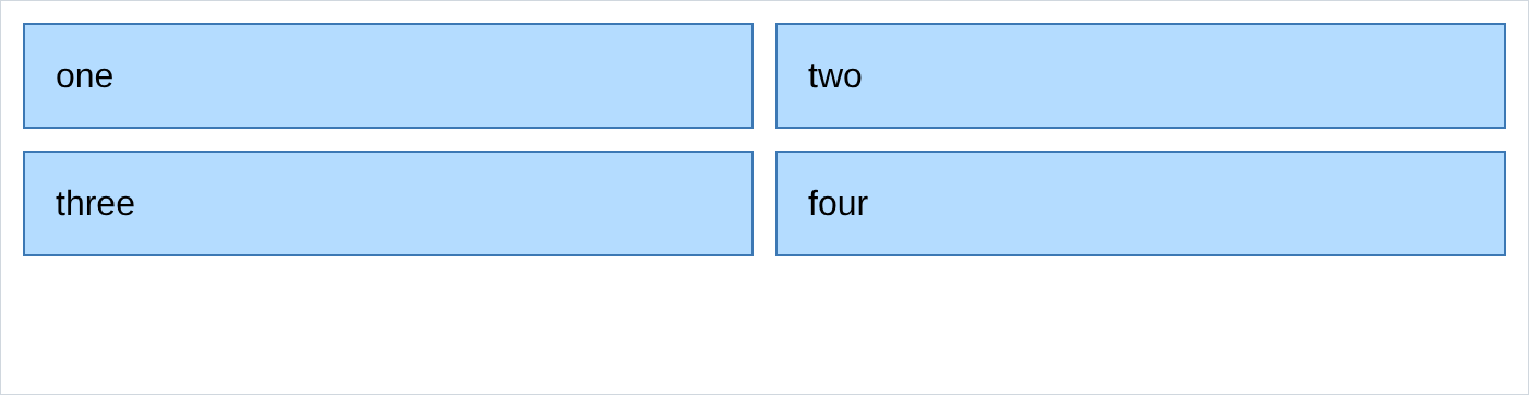
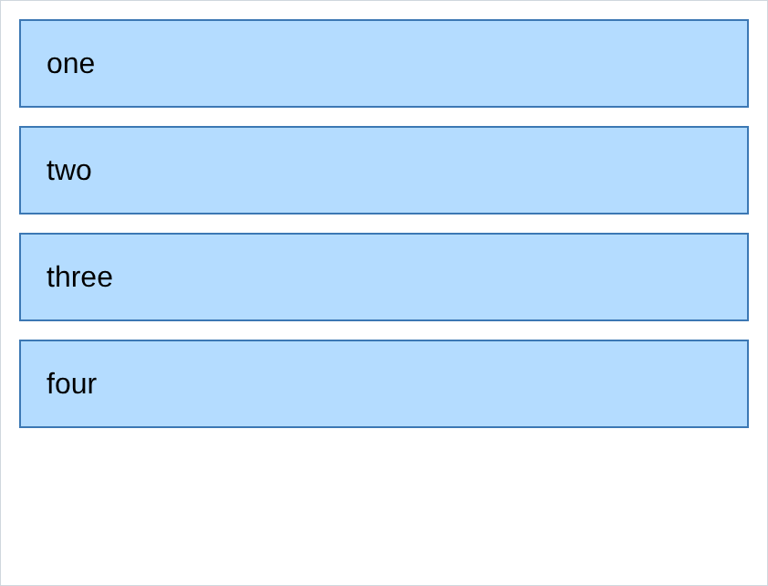
<meta name="viewport" content="width=device-width, initial-scale=1">output of 2, the same file at 900px, 700px and 420px:

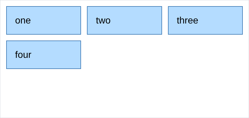
output of 3, the 500px media query moved above the .grid rule, in a 420px window:
output of 8, with the p rule written after the .title rule:

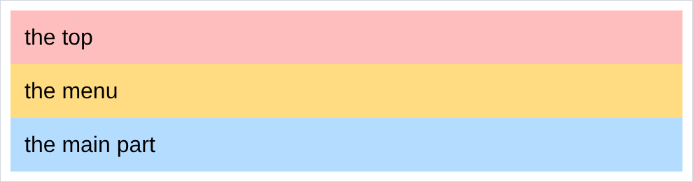
output of 9, and it is the same picture as the div version, because it is the same page:
output of 10:
- in 3, nothing happened, and that is the answer. the window is 420px so the media query
matched, and its
.gridrule was then overwritten by the plain.gridrule underneath it. a media query has no special power, it is an ordinary rule with a condition, and it still loses to whatever comes after it. - in 8 the paragraph is still green. the
prule is written later and it still loses, because.titleis a class andpis an element name, and specificity beats order every time. order is only the tie breaker between selectors of equal strength. - in 6, the paragraph, div and span all went red and Georgia with no rules of their own. the
button stayed black and stayed on the default font. form controls do not inherit, and
font-family: inheritis how u opt them back in. - in 9, comparing the two pages is the exercise. i rendered a div version and a
<header>/<nav>/<main>version and compared them pixel by pixel: zero differences. the benefit is entirely for screen readers, search engines and reader mode. - in 10, the box is 120px and the text is wider than the box.
nowrapdoes not make room, it just refuses to wrap, so something has to overflow. that is the deal. - if ur media queries work on ur laptop and do nothing on ur phone, u are missing the
<meta name="viewport">from 11. it is the most common single reason a responsive page is not responsive.