Time to study: ~50 min You will learn: the real structure every html file has, how to move ur css into its own file, how filepaths work, and how to put an image on a page without stretching it.


← Chapter 4 | back to HTML & CSS 101 | next: Chapter 6 →
everything so far has been a fragment: a
<style>block and a few elements, and the browser was kind enough to draw it. this chapter is the wrapper that goes around every page u write, and it is where ur css moves into its own file.
1. the real skeleton of a page
here is the shape. every page has it, including every page u have ever visited:
<!DOCTYPE html>
<html>
  <head>
    <title>My first real page</title>
  </head>
  <body>
    <p>everything u can see lives in the body</p>
    <button>including this</button>
  </body>
</html>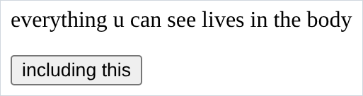
<!DOCTYPE html>is not an element, it is a line saying “use the modern rules”. leave it out and the browser drops into an old compatibility mode where things quietly behave differently. one line, always there, never think about it again.<head>is everything the user cannot see: the tab title, the links to stylesheets and fonts.<body>is everything the user can see: text, buttons, images.- look at the screenshot. the title is nowhere on the page. that is the head doing its job.
2. what goes in the head
the one u will use every time is
<title>, and it sets the text in the browser tab:
<head>
  <title>My first real page</title>
</head>- no screenshot, because the tab is browser furniture, not part of the page. open the file and look at the top of ur window.
- with no
<title>the tab shows the filename, which looks unfinished. <style>belongs in the head too. earlier chapters put it at the top of the file and got away with it because the browser is forgiving.
3. filepaths
a path is how u point at another file from this one. it is read left to right, starting from the folder the html file is in:
href="styles.css"                 the file styles.css, sitting next to the html file
href="css/styles.css"             go into the folder css, then find styles.css
href="css/theme/styles.css"       go into css, then into theme, then find styles.css
href="../styles.css"              go UP one folder, then find styles.css
get one wrong and there is no error message, u just get nothing. here are two
<img>s, the first with a wrong path and the second with a right one:
<img src="thumbnail-1.webp" alt="a video thumbnail">
<img src="thumbnails/thumbnail-1.webp" alt="a video thumbnail">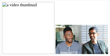
- the broken one shows a torn icon and the
alttext. that is the whole warning. a broken stylesheet path gives u nothing at all, just an unstyled page. ../means go up a level. not in the reference pdf, and u need it the moment ur html is in one folder and ur images are in another.- on linux, paths are case sensitive.
Thumbnail-1.webpandthumbnail-1.webpare different files. on mac and windows they usually are not, which is why a site that worked on someone’s laptop breaks when it reaches a real server. keep everything lowercase. - no spaces in filenames.
4. the external stylesheet
this is the one that changes how u work. take the css out of the html and put it in its own file,
styles.css:
.intro {
  color: rgb(60, 60, 60);
}

.cta {
  background-color: red;
  color: white;
  height: 36px;
  width: 105px;
  border: none;
  border-radius: 2px;
  cursor: pointer;
}
then link it from the head:
<!DOCTYPE html>
<html>
  <head>
    <title>My first real page</title>
    <link rel="stylesheet" href="styles.css">
  </head>
  <body>
    <p class="intro">the css for this page is in another file</p>
    <button class="cta">Subscribe</button>
  </body>
</html>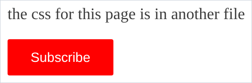
- no
<style>tags inside the.cssfile. the whole file is already css. putting<style>in there breaks everything, and it is the first mistake everyone makes. rel="stylesheet"is not optional. without it the file is fetched and ignored.- why bother: one stylesheet serves 50 pages, so a colour change happens in one place, and the browser downloads it once and reuses it.
- from here on the code blocks say which file each part goes in.
5. a font from google
the fonts u can use for free are the ones already on the reader’s machine, and that is a short and boring list. google fonts is the usual way out of it:
<head>
  <link rel="preconnect" href="https://fonts.googleapis.com">
  <link rel="preconnect" href="https://fonts.gstatic.com" crossorigin>
  <link rel="stylesheet"
    href="https://fonts.googleapis.com/css2?family=Roboto:wght@400;500&display=swap">
</head>
then u can use the name.
font-familygets its proper section in chapter 6, here it is only to prove the font arrived:
.roboto {
  font-family: Roboto, Arial;
}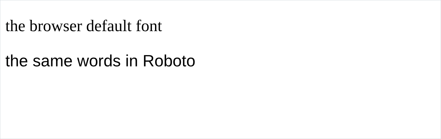
- top line is the browser default, bottom line is Roboto. that screenshot really did fetch the font over the network.
- u do not type those
<link>tags urself. search “google fonts”, pick a font and its weights, and it hands u the block to paste. - pick only the weights u will use. each one is another download. 2 is normal, 5 is a slow page.
Roboto, Arialis a fallback list. if google is unreachable u get Arial, not whatever the browser picks at random.
6. <img>
an image is one element with one attribute:
<img src="thumbnails/thumbnail-1.webp">
<img>has no closing tag and no content.srcis the whole thing.- with no css u get the image at its natural size. that file is 720 by 404, which is usually far too big.
- always add
alt. it is what a screen reader reads out, and what shows when the file is missing, as u saw in section 3.
7. sizing an image
set the
widthand the height follows on its own, keeping the shape:
.thumbnail {
  width: 300px;
}
set both and u are telling the browser to ignore the shape:
.thumbnail {
  width: 300px;
  height: 300px;
}
- the second is squashed, and a squashed image is the most obvious sign of an unfinished page.
- so set one, not both, unless u also do the next section. setting only
heightworks the same way in reverse.
8. object-fit
sometimes u genuinely need a fixed box, say a row of thumbnails that all have to line up, and the images are not all the same shape.
object-fitsays what to do with the mismatch. all 3 of these are in a 200 by 200 box:
<style>
  img {
    width: 200px;
    height: 200px;
    border: 1px solid black;
  }
  .cover { object-fit: cover; }
  .contain { object-fit: contain; }
</style>
<img src="thumbnails/thumbnail-1.webp">
<img class="cover" src="thumbnails/thumbnail-1.webp">
<img class="contain" src="thumbnails/thumbnail-1.webp">
- left, no
object-fit: squashed to fit the box. this is the default and it is almost never what u want. - middle,
cover: the image is scaled up until it fills the box and the overflow is cut off. nothing is distorted, some of the picture is gone. this is the one u want nearly every time. - right,
contain: the image is shrunk until the whole thing fits, leaving empty space above and below. nothing is distorted, nothing is lost, but u get gaps. object-position: top/left/right/bottommoves which part survives the crop, which matters whencoverkeeps cutting off someone’s head.
NOTES
-
altis not optional. it is what a blind user hears, what search engines read, and what shows when the file is missing. for a purely decorative image writealt=""on purpose, which tells a screen reader to skip it. leave the attribute out and it reads the filename out loud instead. -
<meta charset="UTF-8">goes in the head and stops accented characters and emoji turning into rubbish. paste it in every page. -
<meta name="viewport" content="width=device-width, initial-scale=1">also goes in the head. without it a phone pretends to be a 980px desktop and shrinks ur whole page. it does nothing on a desktop, so u will not notice it is missing until u check on a phone. always have it. -
image formats:
jpegfor photos,pngwhen u need transparency,svgfor icons and logos because it is a drawing and stays sharp at any size,webpfor photos when u care about file size. the asset pack for chapter 12 has all 4. -
an
<img>sits on the text baseline, which leaves a few mysterious pixels of space under it.display: blockremoves them. that is chapter 7, and ur own.thumbnailrule in Youtube.html already has the line. -
u can have more than one stylesheet. they are read in order and the later one wins, same rule as always.
Assignment
the exercises in this chapter follow HTML & CSS Full Course by supersimple.dev, and the images part follows the same course at 2:11:08.
- Take any page u made in chapter 4 and rewrite it with the full skeleton: doctype, html, head, body.
- Give it a title and check the browser tab.
- Move every line of ur css into a
styles.cssnext to it, and link it from the head. - Break the
hrefon purpose and reload. Write down what u see, and what u do not see. - Make a folder called
css, movestyles.cssinto it, and fix the path. - Put one of the thumbnails from the youtube-clone folder on the page.
- Make it 300px wide, and check what happened to its height without u asking.
- Now set the height to 300px as well and look at what it did to the picture.
- Keep the 300 by 300 box, but fix the picture with
object-fit. Trycoverandcontainand decide which one u would ship. - Load Roboto from google fonts and put it on ur
<body>. - Add an
altto the image, then break thesrc, and reload.
stuck, or done and want to check? the solutions are here
or see it finished: the assignment is running here, as a real page u can scroll, hover and drag narrower. the edit it button on it opens the same code in the playground.