Time to study: ~60 min You will learn: every text property u will actually use, the small elements that style one word in the middle of a sentence, and how to make a text box that does not look like 1998.


← Chapter 5 | back to HTML & CSS 101 | next: Chapter 7 →
most of a web page is text. that is easy to forget while u are moving coloured boxes around. this chapter is the properties that make the words look deliberate.
1. font-family, and why u write a list
/* styles.css */
.a { font-family: Arial; font-size: 24px; }
.b { font-family: Georgia; font-size: 24px; }
.c { font-family: "Courier New"; font-size: 24px; }
<!-- index.html -->
<p class="a">Arial, the safe one</p>
<p class="b">Georgia, a serif</p>
<p class="c">Courier New, fixed width</p>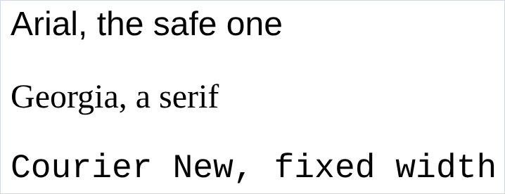
- a font name with a space goes in quotes:
"Courier New". - u can only use a font the reader already has, unless u load one (chapter 5). Arial, Georgia, Courier New, Times New Roman and Verdana are on nearly every machine.
- so u write a font stack, a list of fallbacks in order:
body {
  font-family: Roboto, Verdana, Arial;
}
that means: use Roboto. if it is not there, Verdana. if that is not there either, Arial. the browser walks the list until something works.
- put the font on
<body>and every element on the page inherits it. that is one line instead of thirty, and chapter 11 explains why it works.
2. font-size and font-weight
/* styles.css */
.big  { font-size: 30px; }
.bold { font-weight: bold; }
.w300 { font-weight: 300; }
.w500 { font-weight: 500; }
.w900 { font-weight: 900; }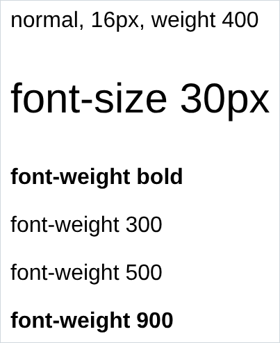
font-size: 16pxis the browser default. that is whereremin chapter 3 gets its number.font-weighttakesbold, or 100 to 900 in hundreds.400is normal,700isbold,500is the half step for a slightly heavier title.- look at the 300 line. it is identical to the normal one, and 900 is identical to bold. a weight only exists if the font file has it. Arial ships regular and bold, so every number rounds to one of those. that is what
wght@400;500in the chapter 5 google fonts block is choosing.
3. font-style, text-decoration and text-align
/* styles.css */
.italic { font-style: italic; }
.under  { text-decoration: underline; }
.none   { text-decoration: none; }
.center { text-align: center; }
.right  { text-align: right; }
p { width: 400px; }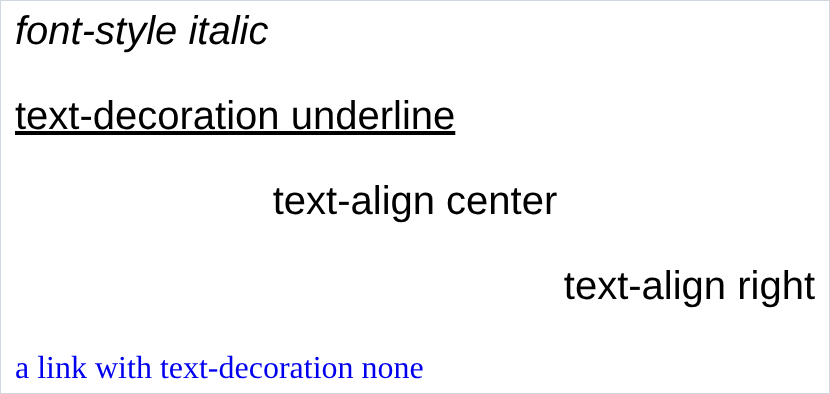
text-decoration: nonekills the underline on a link. every navigation menu on the internet has that line somewhere.text-alignmoves the text inside the element, not the element. those paragraphs are 400px wide and every one still starts at the left edge of the page. only the words moved. centring the element itself is chapter 7.- values:
left,right,center,justify.justifystretches the spaces so both edges line up, and on a narrow column it looks terrible.
4. line-height
the space between the lines inside one paragraph. here is a paragraph with the browser default, on a grey background so u can see the block:
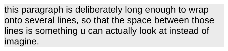
and the same paragraph with the line height turned up:
/* styles.css */
p {
  font-size: 16px;
  width: 380px;
  line-height: 28px;
}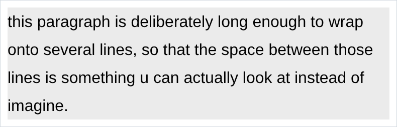
- same words, and the second is easier to read. that is the whole property.
- aim for about 1.5 times the font size, so 16px text wants 24 to 28px. the default is about 1.2, too tight for anything longer than a sentence.
- written with no unit,
line-height: 1.5, it scales with whatever font size the element ends up with. usually the better version.
5. text elements, styling part of a line
everything so far styles a whole element. to style part of a sentence u need an element around just that part, and there are small ones made for the job:
<!-- index.html -->
<p>this is a <strong>strong</strong> word</p>
<p>this is an <u>underlined</u> word</p>
<p>this is a <span>span</span>, which looks like nothing</p>
<p>this is a <a href="https://youtube.com">link</a> in a sentence</p>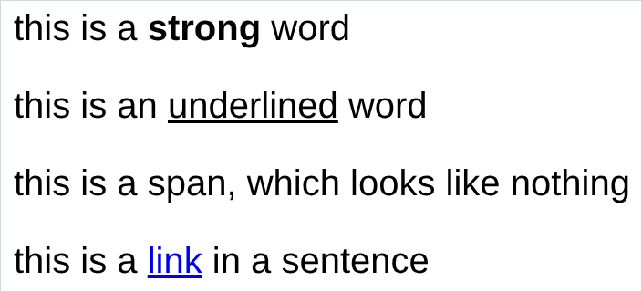
- these are text elements, or inline elements. they sit inside a line of text instead of taking a line of their own, so the sentence flows around them.
<strong>is bold,<u>is underlined,<a>is a link, built in.<strong>also tells a screen reader “this is important”, which is why it exists as well as css bold.
6. <span>, the one with no opinions
look at the third line of that screenshot again. the
<span>is invisible: it looks exactly like the text around it. that is the point of it.
/* styles.css */
.shop-link {
  color: rgb(0, 100, 200);
  text-decoration: underline;
  font-weight: bold;
}
<!-- index.html -->
<p>go and look at the <span class="shop-link">shop</span> before u decide</p>
<span>has no styles of its own. it exists as something to hang a class on, so u can reach one word in the middle of a sentence.- the pattern:
<span class="...">around the bit u want, then a rule for the class. <span>is to a line of text what<div>is to a block of the page.<div>opens chapter 7.
7. <input>, a text box
<!-- index.html -->
<input type="text">
<input type="text" placeholder="Search">
<input>has no closing tag, same family as<img>and<link>.typedecides which control u get:text,checkbox,password,email,number,date,color,file.placeholderis not a label. it is a grey hint that disappears the moment someone types, so it is gone exactly when they need it. nothing important goes in there.
8. styling the box, and ::placeholder
/* styles.css */
.search-bar {
  font-family: Arial;
  font-size: 20px;
  height: 36px;
  width: 300px;
  border: 1px solid rgb(190, 190, 190);
  border-radius: 2px;
}
.search-bar::placeholder {
  color: rgb(150, 150, 150);
  font-size: 14px;
  font-style: italic;
}
<!-- index.html -->
<input class="search-bar" type="text" placeholder="Search">
font-sizeon.search-barsets the size of what the user types. the placeholder ignores it.::placeholderhas 2 colons, so it is a pseudo-element: a piece of the element with no tag of its own.:hoverhad one colon and is a pseudo-class, a state. the extra colon is how u tell them apart.- in the screenshot the box is 20px and the placeholder is 14px italic. 2 rules, 2 different things, on purpose.
9. checkboxes and labels
<!-- index.html -->
<input type="checkbox"> a plain checkbox

<input type="checkbox" id="agree">
<label for="agree">a checkbox with a label u can click</label>
- they look almost the same and behave differently. on the first, only the square is clickable. on the second, clicking the words ticks the box.
<label for="...">matches the input’sidand the two become one control. it is the one place ids earn their keep, and it makes a form far less annoying on a phone.- ur operating system draws the checkbox itself. u can move it and size it, and mostly not recolour it. that is normal.
NOTES
-
<p>comes with space above and below it that u never asked for. every screenshot in this chapter has it. it is a default margin, and switching it off is the first thing most real stylesheets do. that is chapter 7. -
<b>and<i>still work and do the same thing as<strong>and<em>visually. the difference is meaning:<strong>says important,<b>just says bold. use<strong>and<em>. -
<br>forces a line break. it is fine for an address or a poem and wrong for spacing things out. if u are typing 3<br>s in a row, u wanted margin. -
text properties are inherited. set
font-familyon<body>and everything inside gets it, without a single other rule.background-colorandwidthdo not work that way. chapter 11 explains which do and which do not. -
<h1>to<h6>are the headings. big and bold by default, restyle them to anything. use<h1>once for the real title, then<h2>for sections, in order. search engines and screen readers read that order as the outline of ur page. -
text-transform: uppercaseshouts without u typing caps. worth knowing, because SUBSCRIBE typed in caps reads badly to a screen reader, and this way the html still says Subscribe.
Assignment
the exercises in this chapter follow HTML & CSS Full Course by supersimple.dev, and the inputs part follows the same course at 2:11:08.
- Put 3 paragraphs on a page in 3 different fonts.
- Set a font stack on
<body>with 3 names in it, and delete thefont-familyfrom the individual paragraphs. Check that they all still changed. - Make one paragraph 30px, one bold, and one
font-weight: 300. Look hard at the 300 one and explain why it looks the way it does. - Make a link with no underline.
- Write a paragraph long enough to wrap over 4 lines, give it a width, and open up the space between the lines.
- Centre the text inside that paragraph. Then check whether the paragraph itself moved.
- Take one word out of the middle of a sentence and make it blue and bold, without touching the rest of the sentence.
- Put a text box on the page with a placeholder that says Search.
- Make the box 36px tall and 300px wide with a thin grey border, and make the placeholder text smaller and grey.
- Add a checkbox with a label u can click on to tick it.
stuck, or done and want to check? the solutions are here
or see it finished: the assignment is running here, as a real page u can scroll, hover and drag narrower. the edit it button on it opens the same code in the playground.