Time to study: ~35 min You will learn: the 4 ways to write a colour and what the numbers in them mean, plus the 4 units u measure things in and which one to reach for.


← Chapter 2 | back to HTML & CSS 101 | next: Chapter 4 →
chapter 2 was the properties. this one is the values, and it is short on purpose. every property accepts certain kinds of value:
background-colorwants a colour,widthwants a measurement. those are the two u type a hundred times a day.
1. a colour name
the easiest one, and the one u start with:
button {
  background-color: red;
}
- about 150 names are built in:
red,white,black,grey,tomato,steelblue. - fine for testing, almost never what u ship. ur red and a designer’s red are different reds, and only one of them has a name.
- so u use them for 10 minutes while a layout comes together, then replace them with the next two.
2. rgb, mixing 3 numbers
every colour a screen can show is red, green and blue light added together. that is what a pixel physically is.
rgb()lets u say how much of each:
button {
  background-color: rgb(0, 150, 255);
}
each number goes from 0 (none of that light) to 255 (all of it). so:
rgb(0, 0, 0);         /* no light at all, black */
rgb(255, 255, 255);   /* all 3 at full, white */
rgb(255, 0, 0);       /* only red, red */
rgb(255, 0, 0)and the wordredare the same colour. not similar, the same. i rendered both and compared them pixel by pixel: no difference.- black is no light and white is all of it, which is backwards from mixing paint and catches everyone once.
- why 255 and not 100: each number is one byte, and a byte holds 256 values.
- nobody works these out in their head. u pick a colour in a picker and copy what it gives u.
3. hex, the same numbers written shorter
hex is rgb wearing a different hat. same 3 numbers, same 0 to 255, written in base 16 and glued together after a
#:
button {
  background-color: #0096FF;
}
that is the same blue as section 2. i compared those two renders as well: zero differing pixels.
base 16 means each character has 16 possible values instead of 10:
0 1 2 3 4 5 6 7 8 9 A  B  C  D  E  F
0 1 2 3 4 5 6 7 8 9 10 11 12 13 14 15
two characters together give u 16 * 16 = 256 values, which is exactly the 0 to 255 that rgb uses. so the 6 characters split into 3 pairs:
#0096FF
 │ │ └── blue  = FF = (15 * 16) + 15 = 255
 │ └──── green = 96 = (9 * 16) + 6 = 150
 └────── red   = 00 = 0
- so
#0096FFisrgb(0, 150, 255)in 7 characters instead of 18. that is the whole reason it exists. - u never do this arithmetic. every picker gives u both. i worked it out once here so the format stops looking like magic.
- hex is not case sensitive.
- hex cannot be see-through. that is the next one.
4. rgba, and see-through colours
rgbaisrgbwith a 4th number on the end, the alpha, and it controls how see-through the colour is.0is invisible,1is solid.
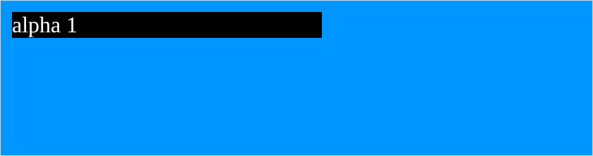
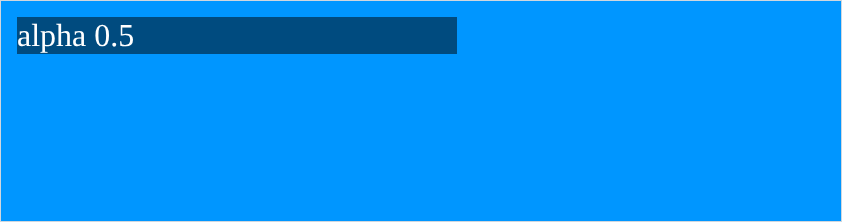
here is a black paragraph on a blue page, at 3 different alphas. first 1:
body {
  background-color: rgb(0, 150, 255);
}
p {
  background-color: rgba(0, 0, 0, 1);
  color: white;
  width: 220px;
}
then
0.5:
then
0.15:
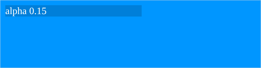
- the black never changes. what changes is how much blue comes through it.
rgba(0, 0, 0, 1)andrgb(0, 0, 0)are identical. alpha defaults to 1.- reach for this for a shadow, a dim overlay, or a hover that darkens slightly. a faint black at
0.05looks right over any background, where a specific grey only looks right over one. - ur own Youtube.html uses
rgba(96, 97, 97, 0.05)behind the videos for exactly that reason.
5. px, the pixel
a pixel is a dot on the screen, and
pxis the unit u will use most:
p {
  background-color: black;
  color: white;
  width: 200px;
}
- i measured that bar in the screenshot: 200 pixels across.
pxmeans what it says. - a 4K screen is 3840px wide and a phone is about 400px. that gap is the whole reason chapter 11 exists.
pxis fixed and does not care how big the window is. that is why it is easy, and why a page built only inpxbreaks on a phone.
6. %, a share of the container
a percentage is measured against whatever the element is sitting inside:
p {
  background-color: black;
  color: white;
  width: 50%;
}
- that window is 600px and the bar came out 292px, not 300px. the missing 8px is the default margin around
<body>, so the container is 584px and half is 292. chapter 7 switches that margin off, and it is the first line of css in most real pages. - percentages resize with the window, which is why a
%width is usually a better default than apxone. 50%of what is the thing to keep straight. it is the parent element, not the screen.
7. em and rem
these two are measured against a font size, which sounds strange for a width until u see it. both paragraphs below have
font-size: 20pxand a width of10, one inemand one inrem:
p {
  font-size: 20px;
  width: 10em;
}
p {
  font-size: 20px;
  width: 10rem;
}
the first is 200px, the second is 160px. i measured both.
emmultiplies this element’s font size. it is 20px, so10emis 200px.remmultiplies the page’s font size, 16px unless someone changed it. so10remis 160px and the element’s own 20px is ignored.- the
ris for root. that is the only difference, and it is worth saying out loud a few times. - why bother: if someone has set a bigger default text size, everything in
remgrows with them and everything inpxdoes not. that is a real accessibility argument. - use
pxwhile u are learning, because u can see what u typed. move toremonce the layout has stopped fighting u.
NOTES
-
u do not pick colours by typing numbers. right click a page, Inspect, and devtools has a colour picker with an eyedropper in it (chapter 4). Or search “color picker” and use the first result. Copy the hex out of it.
-
hex has a 3 character short form.
#FFFis#FFFFFF,#000is#000000,#F00is#FF0000. each character is just doubled. it only works when the 3 pairs are each a repeated character. -
transparentis a colour value.background-color: transparentis the same asrgba(0, 0, 0, 0)and reads better. it is how u remove a background someone else set. -
opacityis notrgba.rgbamakes one colour see-through.opacitymakes the whole element see-through, text and all. that is chapter 4. -
vwandvhexist too. 1vw is 1% of the window width, 1vh is 1% of its height, soheight: 100vhis exactly one screen tall. that is how a landing page fills the screen. not in the reference pdf, and u will meet them within a week. -
a number without a unit is ignored.
width: 200is not 200px, it is a dropped line, silently, the same as chapter 2’s typo.0is the one exception,0needs no unit.
Assignment
the exercises in this chapter follow HTML & CSS Full Course by supersimple.dev.
- Make a red button 3 times over: once with the name, once with
rgb, once with hex. Check that all 3 look the same. - Open any colour picker, choose a colour u actually like, and use its rgb value on the button.
- Convert that same colour to hex and use that instead.
- Give the
<body>a blue background and put a paragraph on it with a black background that is 50% see-through. - Take the same paragraph down to 15% see-through.
- Make the paragraph 300px wide.
- Now make it 50% wide, and drag ur browser window narrower and wider while u watch it.
- Give the paragraph
font-size: 20pxandwidth: 10em. Reload, then changeemtoremand reload again. Work out from the two widths what each unit was measuring against.
stuck, or done and want to check? the solutions are here
or see it finished: the assignment is running here, as a real page u can scroll, hover and drag narrower. the edit it button on it opens the same code in the playground.