Time to study: ~60 min
You will learn: the class attribute, which is the most used thing in all of css, plus how to style hover and click, and how to open devtools and stop guessing.


← Chapter 3 | back to HTML & CSS 101 | next: Chapter 5 →
every selector so far has been an element name, so every rule hits everything. this chapter is the fix, and it is what makes real pages possible. if u remember one thing from the first half of this course, make it the class.
1. the problem with styling by element name
here are 3 buttons and one rule:
<style>
  button {
    background-color: red;
    color: white;
    height: 36px;
    border: none;
    cursor: pointer;
  }
</style>
<button>SUBSCRIBE</button>
<button>JOIN</button>
<button>SHARE</button>
- on a real page that is wrong. subscribe is red, join is grey, share is a plain link. all 3 are
<button>and all 3 should look different. - u cannot fix it with what u have.
buttonmeans every button. there is no way to say “that one”.
2. the class attribute
classis an attribute u put on an element, and u make the name up urself:
<button class="subscribe-button">SUBSCRIBE</button>then u select it in css with a dot in front of the name:
<style>
  button {
    height: 36px;
    border: none;
    cursor: pointer;
  }
  .subscribe-button {
    background-color: red;
    color: white;
  }
</style>
<button class="subscribe-button">SUBSCRIBE</button>
<button>JOIN</button>
<button>SHARE</button>
- one button is red, the other two are not, and all 3 are still
<button>. - the dot is part of the selector, not the name. html says
class="subscribe-button"with no dot, css says.subscribe-buttonwith one. i wrote the dot in the html for about a week. - the name can be anything without spaces. it means nothing to the browser, it is a label for u.
- both rules hit the same button:
buttongave it the height,.subscribe-buttongave it the colours. an element collects every selector that matches it.
3. the same class on more than one element
a class is not a name for one element. put it on as many as u want:
<style>
  .youtube-button {
    height: 36px;
    border: none;
    cursor: pointer;
    background-color: rgb(230, 230, 230);
  }
</style>
<button class="youtube-button">SUBSCRIBE</button>
<button class="youtube-button">JOIN</button>
<button>SHARE</button>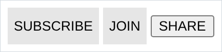
- write the rule once, stick the class on everything that should look like that.
- a class means “these are the same kind of thing”, so name it that way.
.youtube-buttonis a good name..grey-36is a bad one, because the day it stops being grey the name lies.
4. more than one class on one element
an element can carry several classes, separated by a space:
<style>
  .youtube-button {
    height: 36px;
    border: none;
    cursor: pointer;
    background-color: rgb(230, 230, 230);
  }
  .subscribe-button {
    background-color: red;
    color: white;
  }
</style>
<button class="youtube-button subscribe-button">SUBSCRIBE</button>
<button class="youtube-button">JOIN</button>
- both buttons get the shape from
.youtube-button. only the first also gets the red from.subscribe-button. - this is the pattern u use forever: one class for the shared part, a second for the difference. it is why u stop copying the same 6 lines into every rule.
- both classes set
background-colorand red wins, because.subscribe-buttonis written later. the order of the names in the html attribute changes nothing, only the order of the rules does.
5. :hover, styling a state
a pseudo-class is a selector for an element in a particular state.
:hoveris the state of having the mouse on it:
.subscribe-button {
  background-color: red;
  color: white;
}
.subscribe-button:hover {
  background-color: darkred;
}
no screenshot for this one. a hover only exists while a mouse is on the element, and every screenshot in this course is rendered by a browser with no mouse. so u have to do this one urself: type it, reload, point at the button.
- the selector is the normal one with
:hoverglued on. no space. - inside the block, write only what changes. the rest carries over.
- order matters:
.subscribe-button:hovermust come after.subscribe-button, or the plain rule overwrites it and nothing happens. - there is no hover on a touchscreen. never hide anything important behind one.
6. :active, while the mouse is down
:activeis the state between pressing and letting go:
.subscribe-button:active {
  background-color: black;
}- no screenshot either. it needs a real mouse.
- it lasts about a tenth of a second and it is what makes a button feel like it responded. leave it out and the page feels dead in a way people notice and cannot name.
:activegoes after:hover, because while u are clicking u are also hovering, so the later one has to win.
7. opacity
opacitymakes the whole element see-through, and unlike thergbain chapter 3 it takes the text with it:
<style>
  button {
    background-color: red;
    color: white;
    height: 36px;
    width: 120px;
    border: none;
  }
  .half { opacity: 0.5; }
  .ghost { opacity: 0.15; }
</style>
<button>opacity 1</button>
<button class="half">opacity 0.5</button>
<button class="ghost">opacity 0.15</button>
1is solid and is the default.0is invisible.- the white text fades too. that is the difference from
rgba, which only makes one colour see-through. usergbafor a background,opacityfor a whole element. - an element at
opacity: 0is invisible but still there. it keeps its space and u can still click it, which is confusing the first time.
8. transition
without it, a hover snaps.
transitionmakes the change take time:
.subscribe-button {
  background-color: red;
  transition: background-color 0.15s;
}
.subscribe-button:hover {
  background-color: darkred;
}- the shape is
transition: <property> <duration>. more than one, separated by commas:
transition: background-color 0.15s, color 0.15s;- a still image cannot show a transition. it is the 150 milliseconds between the two pictures. point at the button, then delete the line and point at it again. the difference is entirely feel.
- it goes on the normal rule, not the
:hoverrule. the element has to know how to animate before the state changes, and again on the way back out. 0.15sis a good default.1ssounds nice when u type it and feels broken when u use it.transition: all 0.15sworks and is lazy. name the properties, or u animate something u did not mean to.
9. box-shadow
a shadow behind an element. 4 values: how far right, how far down, how blurred, and what colour:
<style>
  button {
    background-color: white;
    height: 40px;
    width: 150px;
    border: none;
  }
  .hard { box-shadow: 3px 4px 5px black; }
  .soft { box-shadow: 3px 4px 0 rgba(0, 0, 0, 0.15); }
  .lifted { box-shadow: 0 2px 12px rgba(0, 0, 0, 0.35); }
</style>
<button class="hard">3px 4px 5px black</button>
<button class="soft">3px 4px 0 faint</button>
<button class="lifted">0 2px 12px faint</button>
box-shadow: 3px 4px 5px black;
            └┬┘ └┬┘ └┬┘ └─┬─┘
             │   │   │    └── colour
             │   │   └─────── blur
             │   └─────────── down
             └─────────────── right
- solid
blackis what u type first, and it looks like a sticker. every shadow on a real site is a faintrgbablack. that is what chapter 3 spent time on the alpha value for. 0blur gives the flat offset block in the middle. that is a deliberate look, not a mistake.- the third, no sideways offset and a big blur, is the “floating slightly above the page” shadow. it is the one u will use most.
- negative values push the shadow left and up.
10. devtools
right click anything on any page and choose Inspect. that opens devtools, and from here on u should have it open whenever u are writing css.
what to use it for, in the order u will need it:
- the Elements panel shows the live html. click any element and the Styles panel on the side shows every rule hitting it, with the file and line number each one came from.
- edit the values right there. click a number, arrow-key it up and down, watch the page move. this is the fastest way to find the number u want, and it is much faster than save-reload-look. nothing u type here is saved to ur file, so when u are happy, copy it back over.
- a declaration with a line through it is a dead one. that is chapter 2’s silent typo, finally visible. it means either u misspelled it or another rule beat it. if u only take one thing from this section, take this one.
- the checkboxes next to each declaration turn a single line on and off without deleting it.
:hovat the top of the Styles panel forces:hoverand:activeon and holds them there, so u can style a hover without keeping ur mouse perfectly still. this is how u work on the two sections of this chapter that have no screenshots.- the box on the right is the box model, and it is chapter 7. come back to it then.
NOTES
-
class naming. no spaces (a space starts a second class). do not start with a digit. lowercase with hyphens is what almost everyone uses:
.video-title,.search-bar,.header-left. -
there is also
id.id="thing"is selected with#thingand is meant to be unique on the page. do not style with it: an id beats every class, and that is a fight u do not want. classes for style, ids for links and javascript. -
:focusis the third state to know. it is being selected by keyboard, usually with Tab. remove the browser’s focus ring and put nothing back, and ur page is unusable for anyone without a mouse. -
:visitedon links styles the ones u already clicked. that purple link colour is a:visitedrule in the browser’s default stylesheet. -
naming is the hard part.
.subscribe-buttonsays what it is..red-buttonsays what it looks like today. use the first kind and u will not rename everything the first time a colour changes. -
u are allowed lots of classes.
class="card card-large card-highlighted"is normal, not a smell.
Assignment
the exercises in this chapter follow HTML & CSS Full Course by supersimple.dev, and the devtools section follows the same course at 1:03:10.
- Put 3 buttons on a page and style all 3 with one
buttonrule. - Give one of them a class and make only that one red, without touching the other two.
- Give 2 of them a shared class that sets the height and removes the border.
- Put a second class on one of those 2 so it is red and the other one is not.
- Make the red button go darker when u put ur mouse on it.
- Make it go darker again while u hold the mouse button down.
- Set the red button to
opacity: 0.5and look at what happened to the text. Then do the same thing withrgbainstead and compare. - Make the hover from task 5 fade over 0.15s instead of snapping. Then move the
transitionline onto the:hoverrule and reload. Work out from what u see why it belongs where it belongs. - Put a faint shadow under the button, 0 across, 2px down, 12px of blur.
- Open devtools on ur page, find ur own class in the Styles panel, and change the colour there without touching ur file.
- Misspell one property on purpose, then find the dead line in devtools.
stuck, or done and want to check? the solutions are here
or see it finished: the assignment is running here, as a real page u can scroll, hover and drag narrower. the edit it button on it opens the same code in the playground.