do the assignment first. reading the answer is not the same as doing it, and u will feel like u learned it when u didn’t.
back to the chapter · see it running
the 4 stylesheets are in sections 3 to 8 of the chapter, rule by rule, and the finished files are Youtube.html and styles/. these are the answers to the parts u have to work out urself.
5, the badge with position: relative deleted:

the badge jumps to the corner of the page. an absolute element measures from its
nearest positioned ancestor, and with relative gone there isn’t one, so the page
takes the job. .video-thumbnail-row exists only to be that ancestor.
9, the video grid with padding-top deleted:
the first row of thumbnails goes behind the header. the header is position: fixed,
so it is out of the flow and the page does not know it is there. the padding is the
room u make for it by hand.
8, the sidebar hover:
.side-button {
  transition: background-color 0.15s;
}
.side-button:hover {
  background-color: rgba(96, 97, 97, 0.2);
}
transition goes on the normal rule, not the :hover rule. put it on the hover and
it fades in and snaps out.
the three layouts:
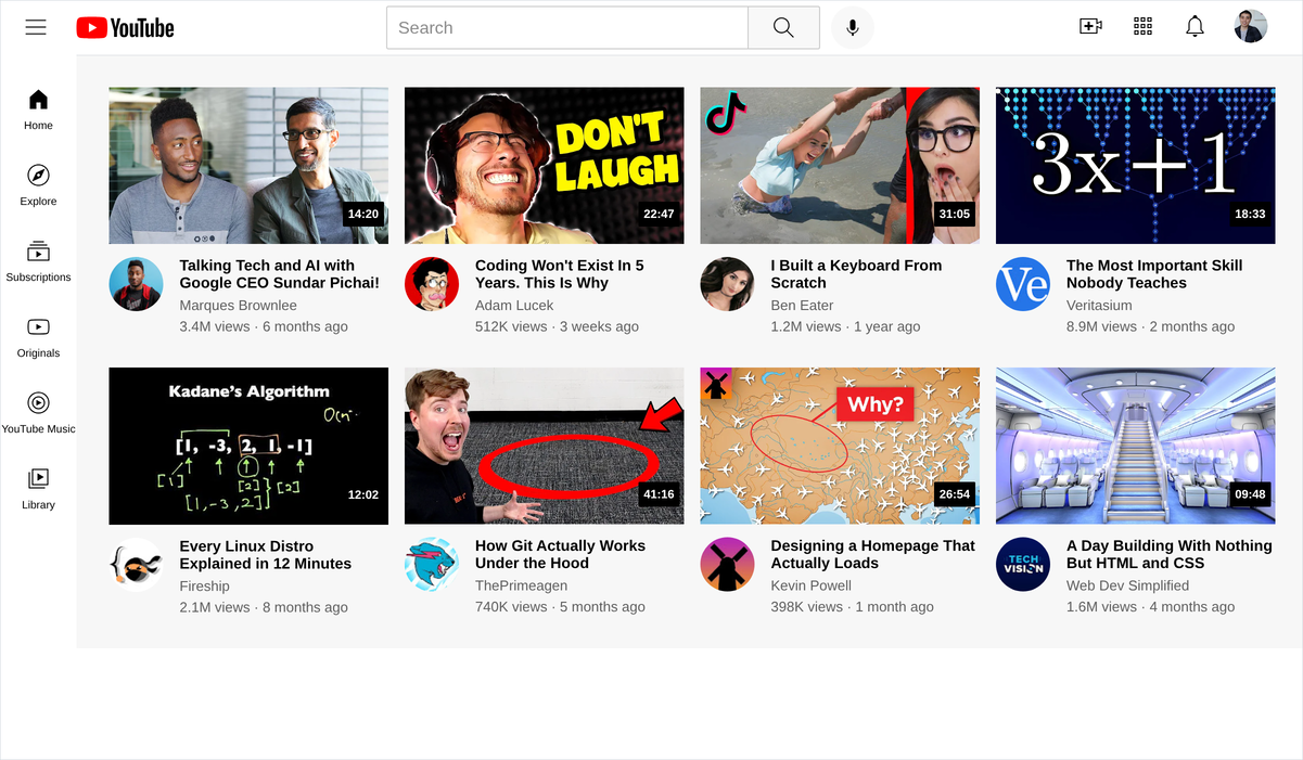
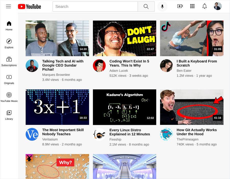
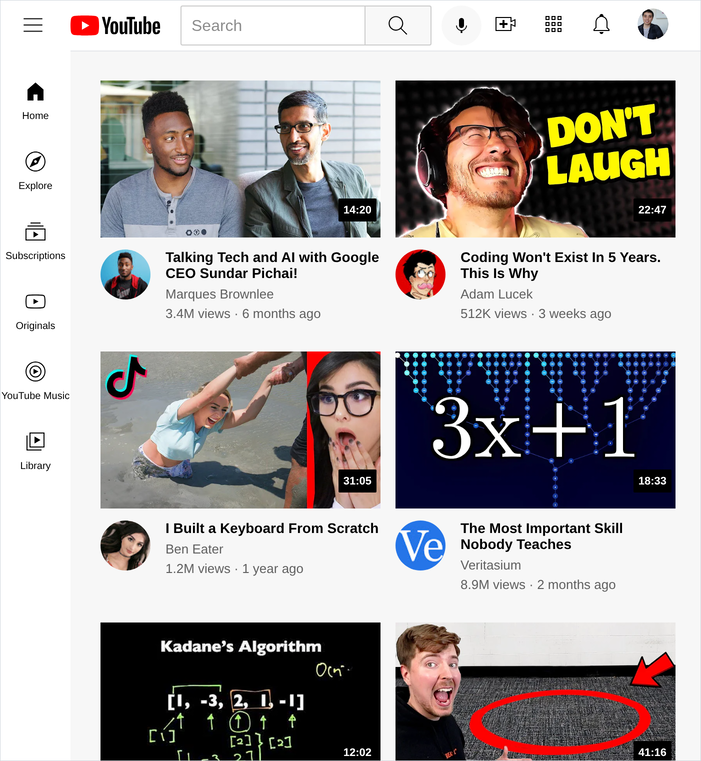
the things that go wrong
- the search bar will not shrink. it needs
width: 0next toflex: 1. an<input>has a built in width that stops it collapsing. - the icons on the right get squashed when the window narrows. the side groups
need
flex-shrink: 0. - the badge sits below the thumbnail instead of on it.
bottom: 16px, not4px. the thumbnail hasmargin-bottom: 12pxand the badge measures from the bottom of the container, margin included. - there is a few pixels of grey under every thumbnail. the image needs
display: block. an<img>sits on the text baseline and leaves a gap under it. - the media queries do nothing. they are above the
.video-gridrule instead of below it, so the plain rule overwrites them. - it looks right on ur laptop and broken on ur phone. no
<meta name="viewport">.